The Ultimate Guide to Choosing Your Outfit for a Stunning Photo Session: Colors, Contrast & Style
Ever stared into your closet before a photo shoot, completely stumped on what will make you look and feel your best on camera? You’re not alone. Whether it’s for an engagement, family, or solo session, your outfit significantly impacts the final images. That’s why coordinating your clothes—their colors, styles, and how they work together—is so important. I believe the goal of good dressing isn’t just to impress friends with your sophisticated taste; it’s primarily to draw the viewer’s attention to your face, not to your clothes or the background.
If you’re not a fashion stylist (I’m not either!), and if finding the perfect clothing match requires some thought, then this article is for you.
At the end of this article, you should know which outfit to choose, whether it’s for an engagement session or a family session.
This guide is pretty theoretical. If you want a more practical guide, check this one for a summer engagement session.
To be clear, this article won’t discuss choosing clothes based on your body shape; that’s a topic for another time. Here, we’ll focus on colors, concluding that it’s all about achieving good contrast and balance.
—Spoiler alert: If you only have 10 seconds, remember RED and BLUE. These two colors, mixed with BEIGE, AND other MUTED NEUTRAL COLORS, almost always work well together.—
Table of Contents
Core Outfit Parameters
When composing your outfit, you can work with three main parameters:
- The color of your clothes: This includes bright versus dark tones and saturated versus unsaturated colors. This is the most crucial part!
- The natural impact of each garment: This is determined by its material, pattern, and texture. We’ll explore how to choose these.
- Style: Whether it’s casual, dressed up, romantic, or sportswear, you and your companions should aim for a somewhat consistent style.
To understand this better, we’ll start with some theory. I’ll introduce a wonderful tool: the color wheel. With this, you’ll see how outfit choices can make you appear taller, stronger, slimmer, or larger. But that’s not all; understanding color balance will help you learn how to be noticed immediately when you enter a room, or how to blend in, if you prefer.
A Friendly Reader Warning
Before we dive in, I want to be honest: I don’t have THE definitive truth, and there probably isn’t just one. What’s explained below is theoretical. As is often the case in artistic fields, the opposite can sometimes work surprisingly well! I’m not offering absolute truths, just some simple guidelines. Furthermore, there isn’t one perfect solution for everyone. These rules must be applied considering your physical attributes: your skin, eye, and hair color, as well as your height and build.
Part 1: Defining Color Characteristics
Since we’ll be discussing colors, let’s start with a quick reminder of the three qualities used to define them: hue, tone, and saturation.
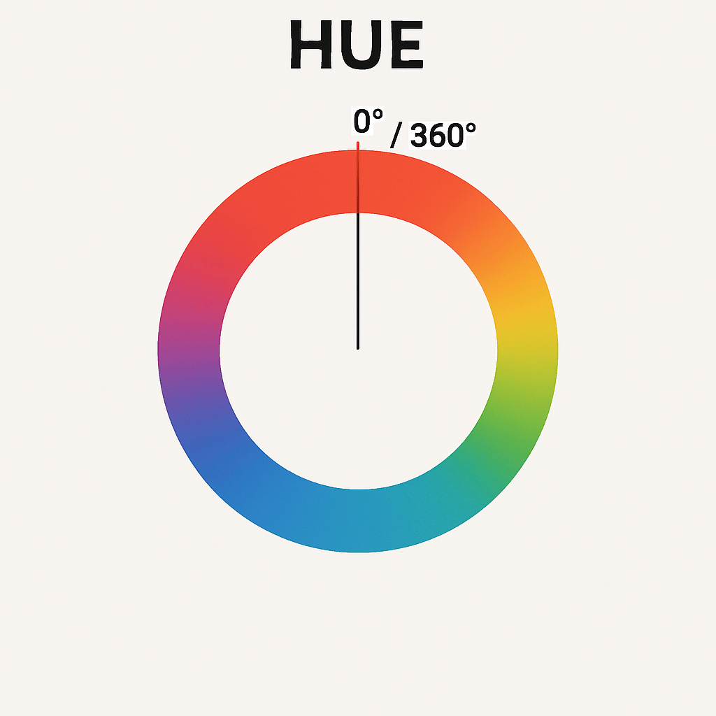
Hue
When daylight is diffracted (using a prism, for instance), you see all the colors of the rainbow: red, orange, yellow, green, cyan, blue, and violet. Imagine curving this rainbow into a circle. Each color occupies a different position on this circle, at different angles (from 0 to 360°). Hue is the measurement of the angle of each color.
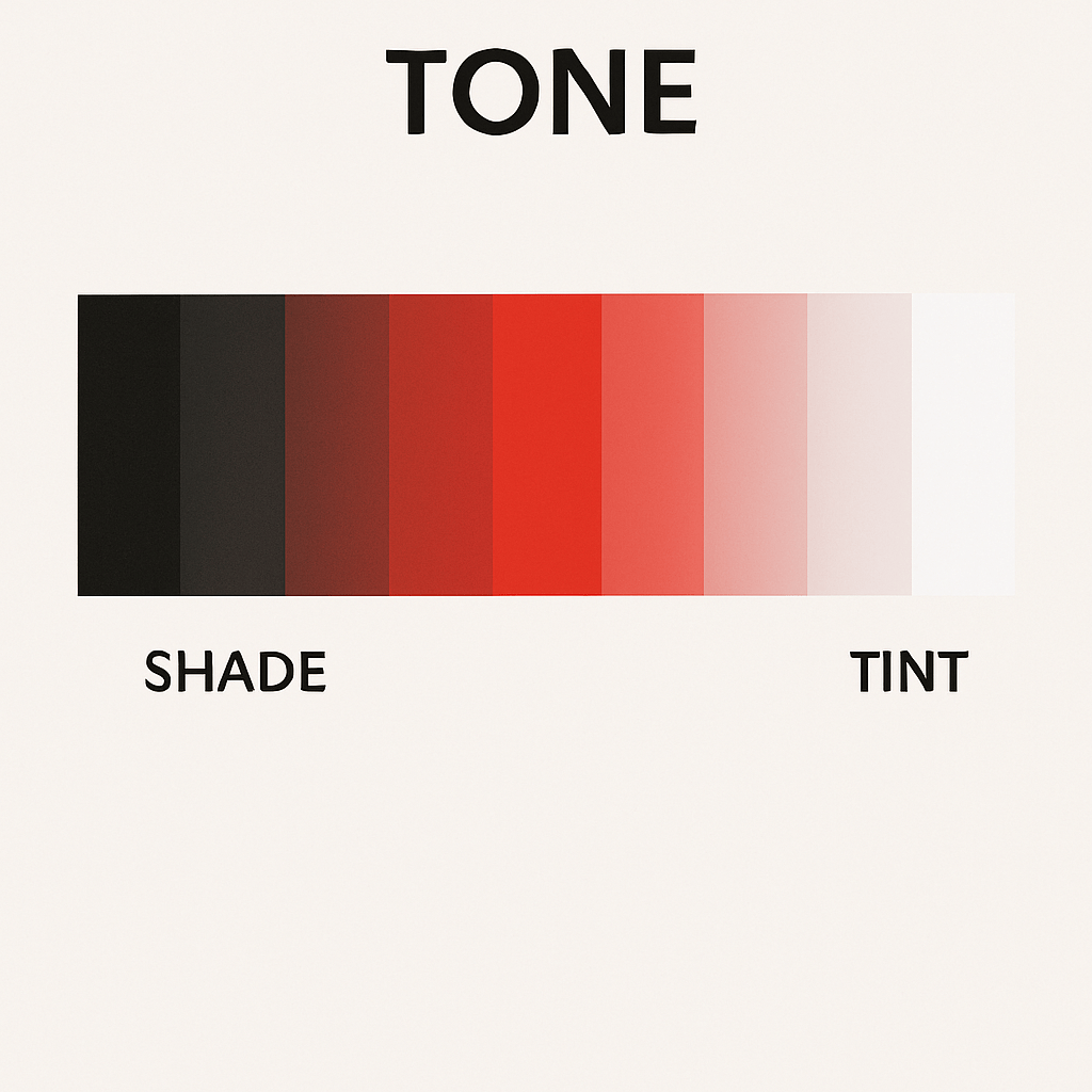
Tone
Each color has a tone, which refers to its luminosity variation, from black to white. Dark tones of a color are called shades, while bright tones are called tints. For instance, brown is a shade of red, while pink is a tint of red.
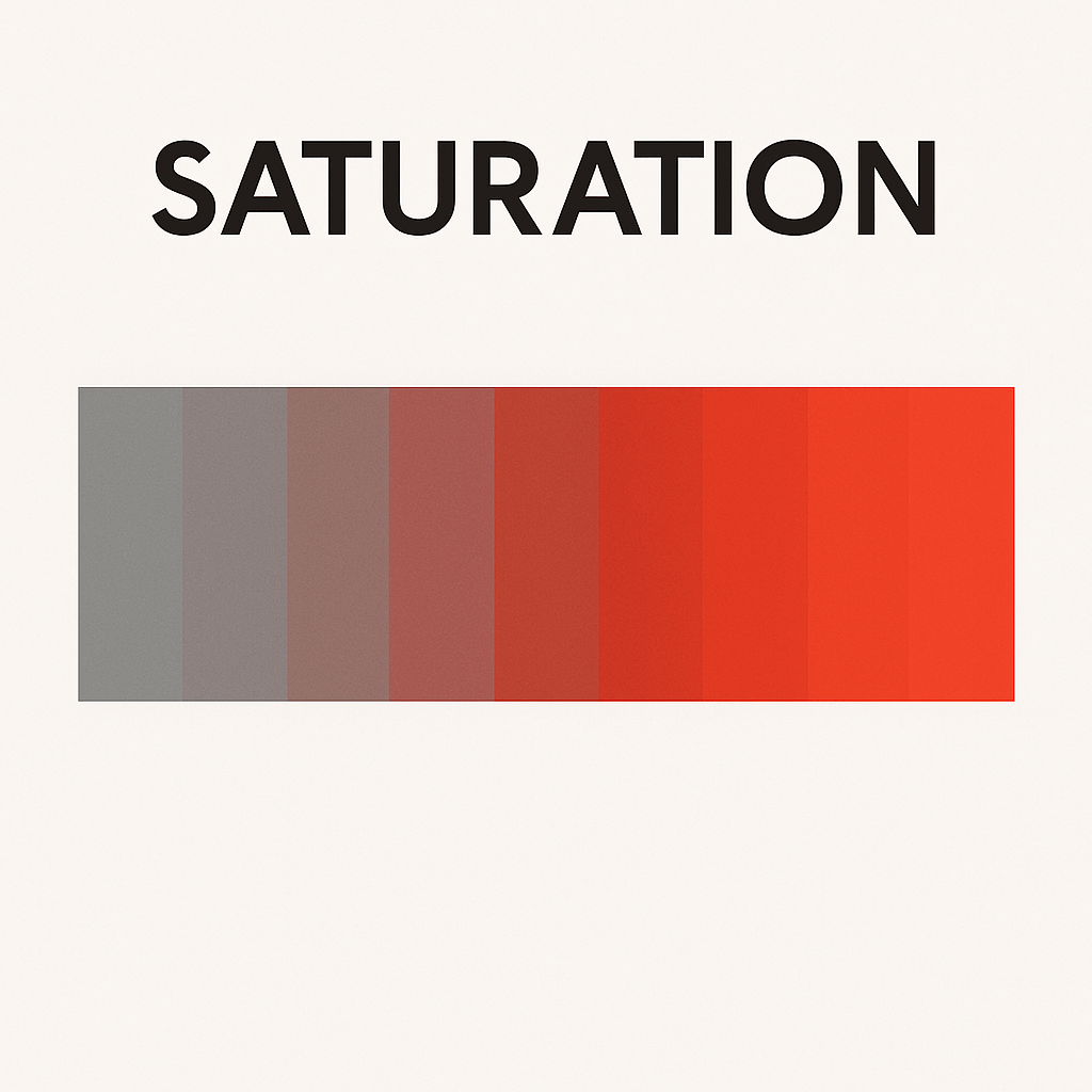
Saturation
Each color can be more or less saturated. Saturation is the variation of color intensity, from the purest form of the color to gray.
A quick note: Officially, white, black, and all shades of gray are not considered colors (even if your closet is full of them).
Color Categories by Formation
Those categories are often used in painting.
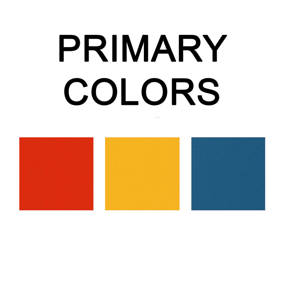
Primary Colors
True red, true blue, and true yellow. These colors cannot be created by mixing others. They are the most visually striking and stand out on any background. Wearing all three in solid tones can feel intense, but muted variations can be balanced for stylish results.
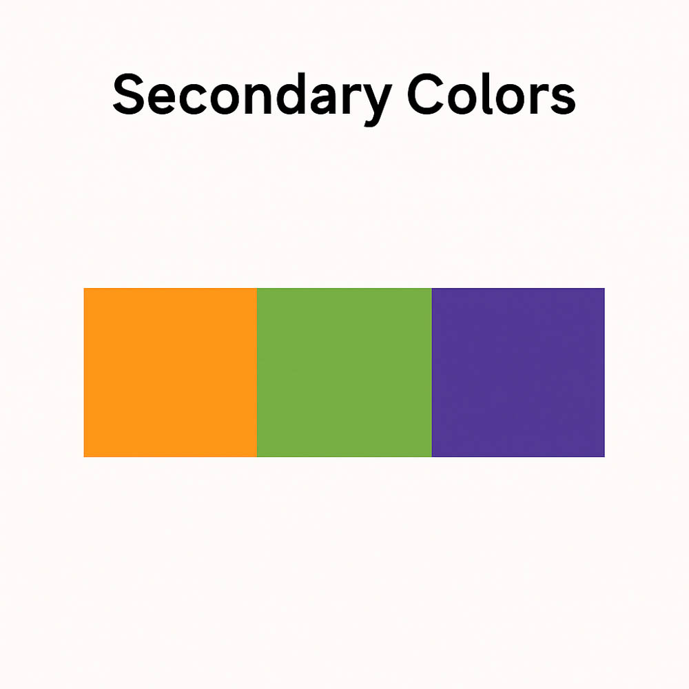
Secondary Colors
Green, orange, and purple. These are made by mixing two primary colors. They are slightly less intense than primaries but still eye-catching. Used together, they can create energetic combinations.
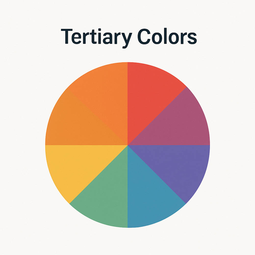
Tertiary Colors
Formed by mixing a primary with a neighboring secondary color (e.g., yellow-green, red-orange). These are more nuanced and less intense, often used to complement or soften stronger colors in an outfit.
Part 2: Color Wheel Theory, Understanding Harmonious Combinations
Historically, painters used the color wheel to choose the right color combinations. Isaac Newton theorized it in 1666. It’s a wheel representing each plain color of the rainbow (hue). For dressing purposes, we generally don’t need more than three main colors!
Interactive Color Wheel
Click a color on the wheel. Adjust saturation/lightness with sliders.
Color Harmony Relationships
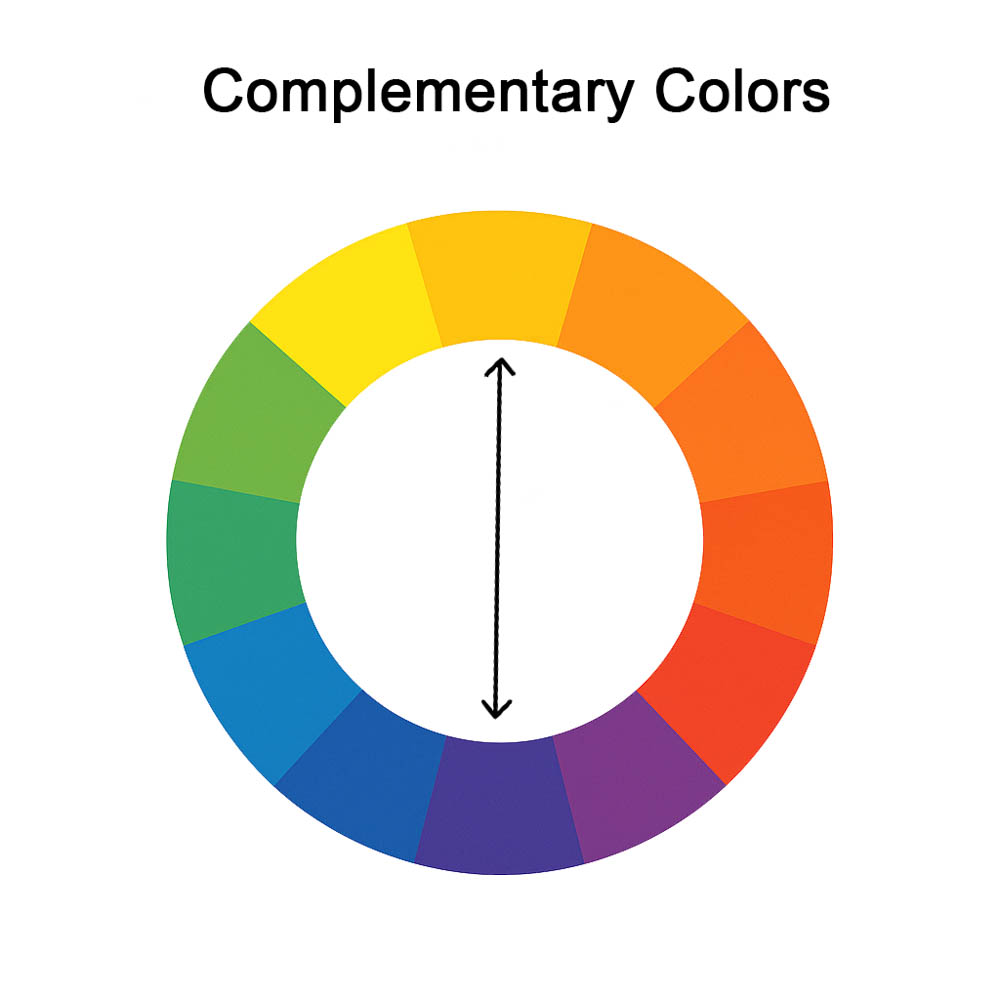
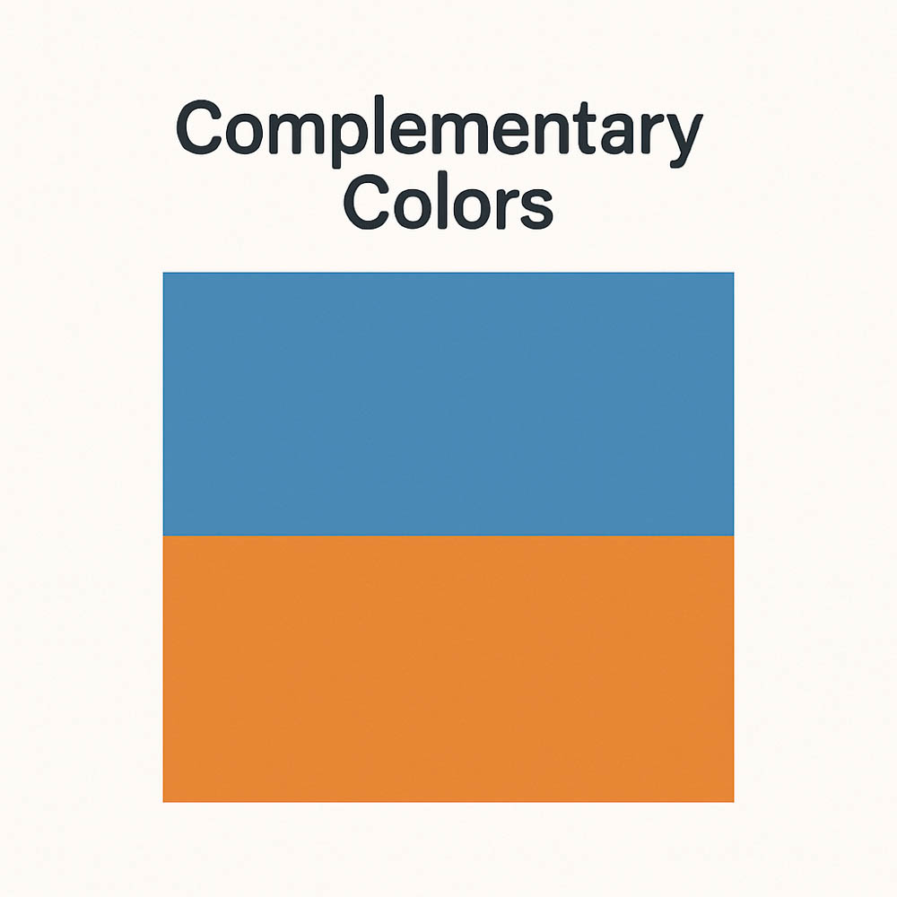
Complementary Colors
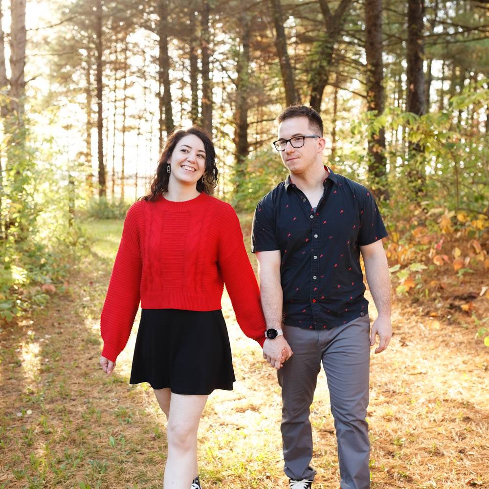
Two colors that sit directly opposite each other on the color wheel (e.g., red and green, blue and orange). These offer maximum color contrast and visual energy. In outfits, they are best used with restraint or in muted tones to avoid looking too loud.
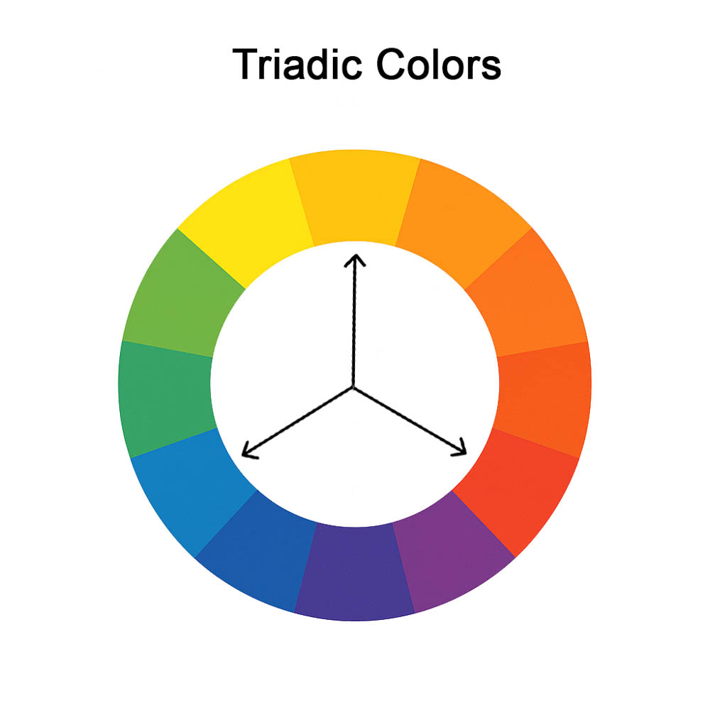
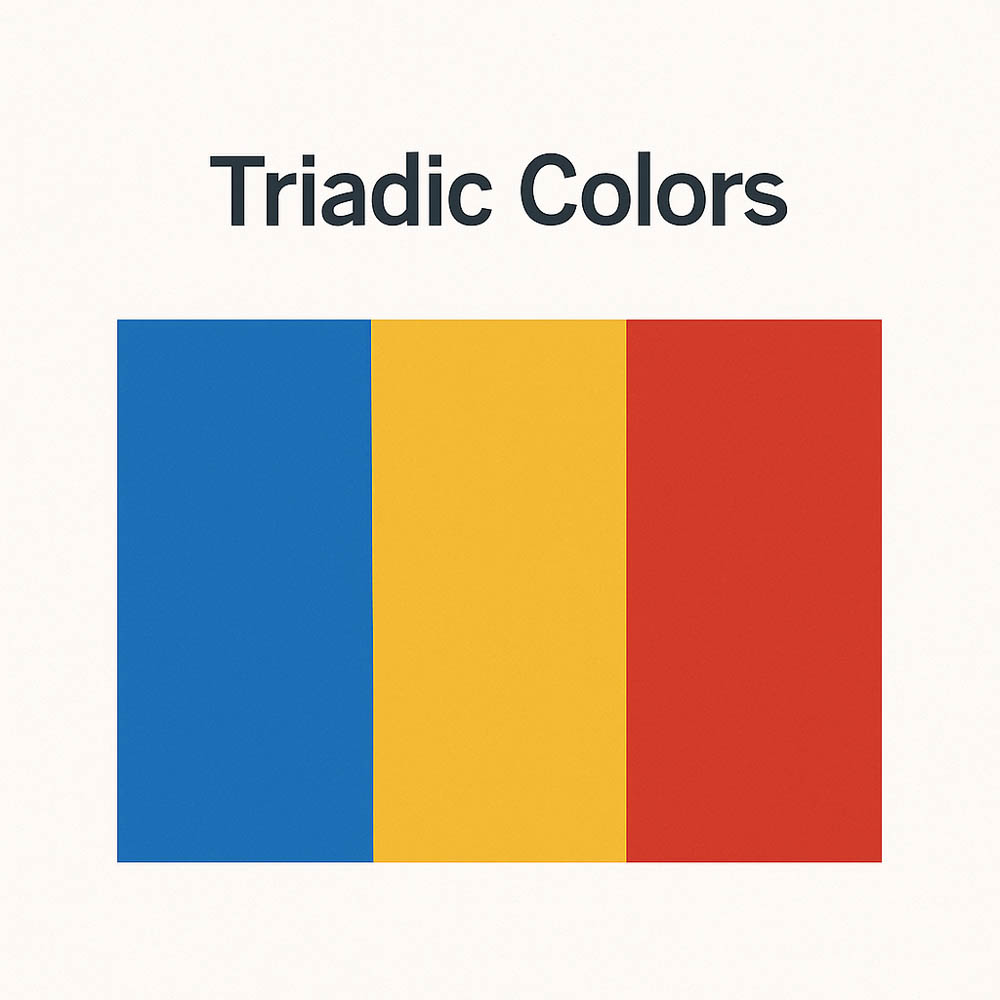
Triadic (or Triad) Colors
Three colors evenly spaced on the color wheel (e.g., red, yellow, blue). This scheme creates a high level of contrast but remains balanced if one color dominates and the others support. Often considered bold and playful.
Notice that the primary colors and secondary colors are Triadic on the color wheel.
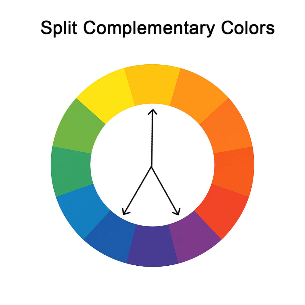
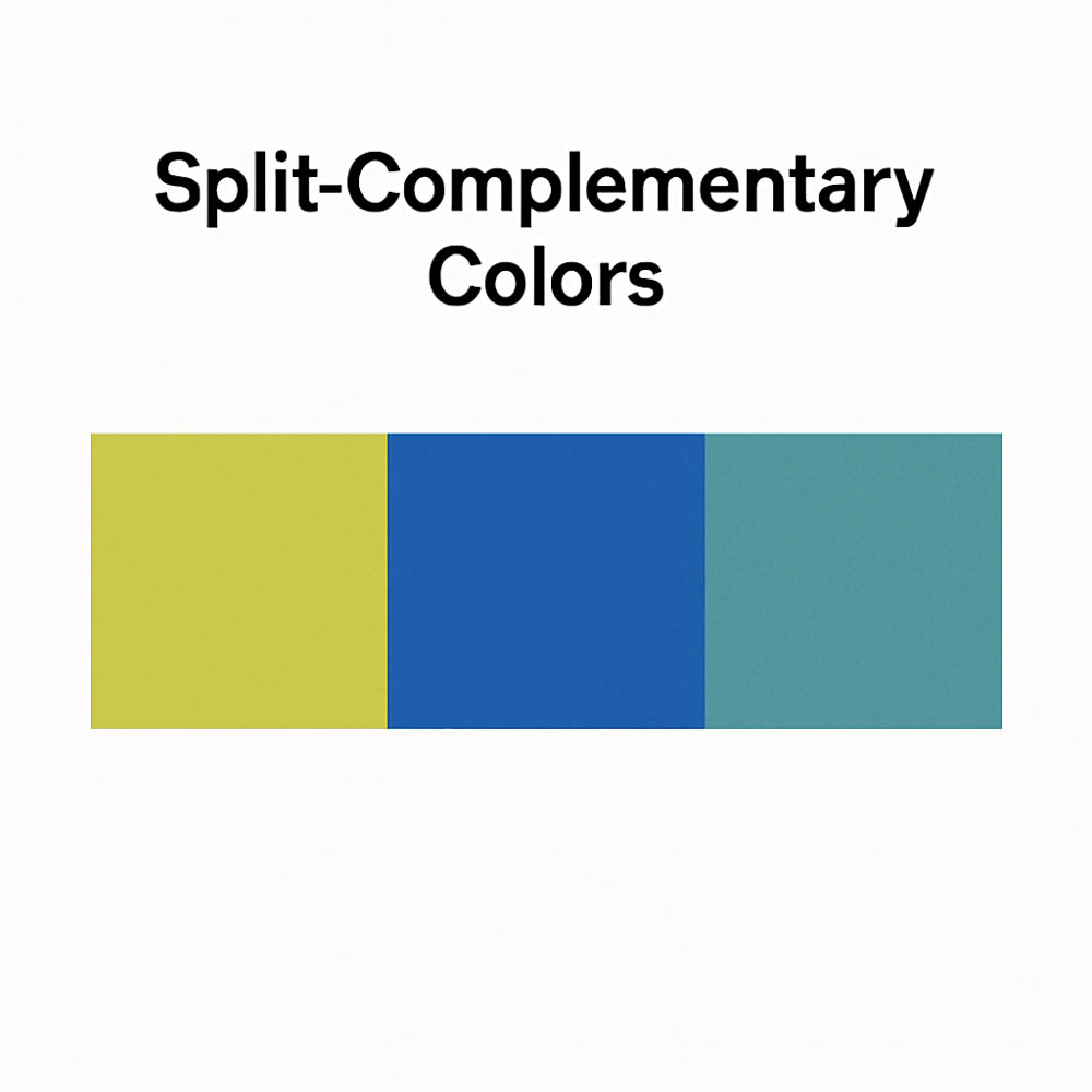
Split Complementary
A base color combined with the two colors adjacent to its complementary color. This gives strong contrast with more subtlety than direct complements, making it more wearable in fashion and design.
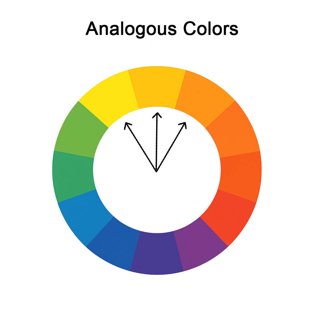
Analogous Colors
Colors that sit side by side on the color wheel (like blue, blue-green, and green). These combinations are harmonious and low in contrast, making them ideal for subtle, cohesive palettes.
Neutrals: The Unsung Heroes of Your Wardrobe
A neutral color is one that doesn’t strongly lean toward any specific hue on the color wheel and typically has low saturation. These colors blend effortlessly with other tones and don’t compete for visual attention. Neutrals can appear as light tints or dark shades, offering versatility across brightness levels.
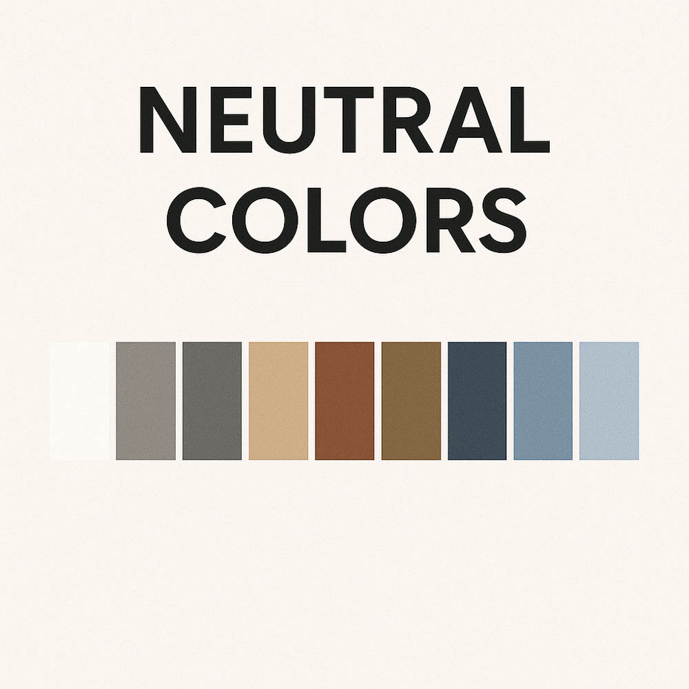
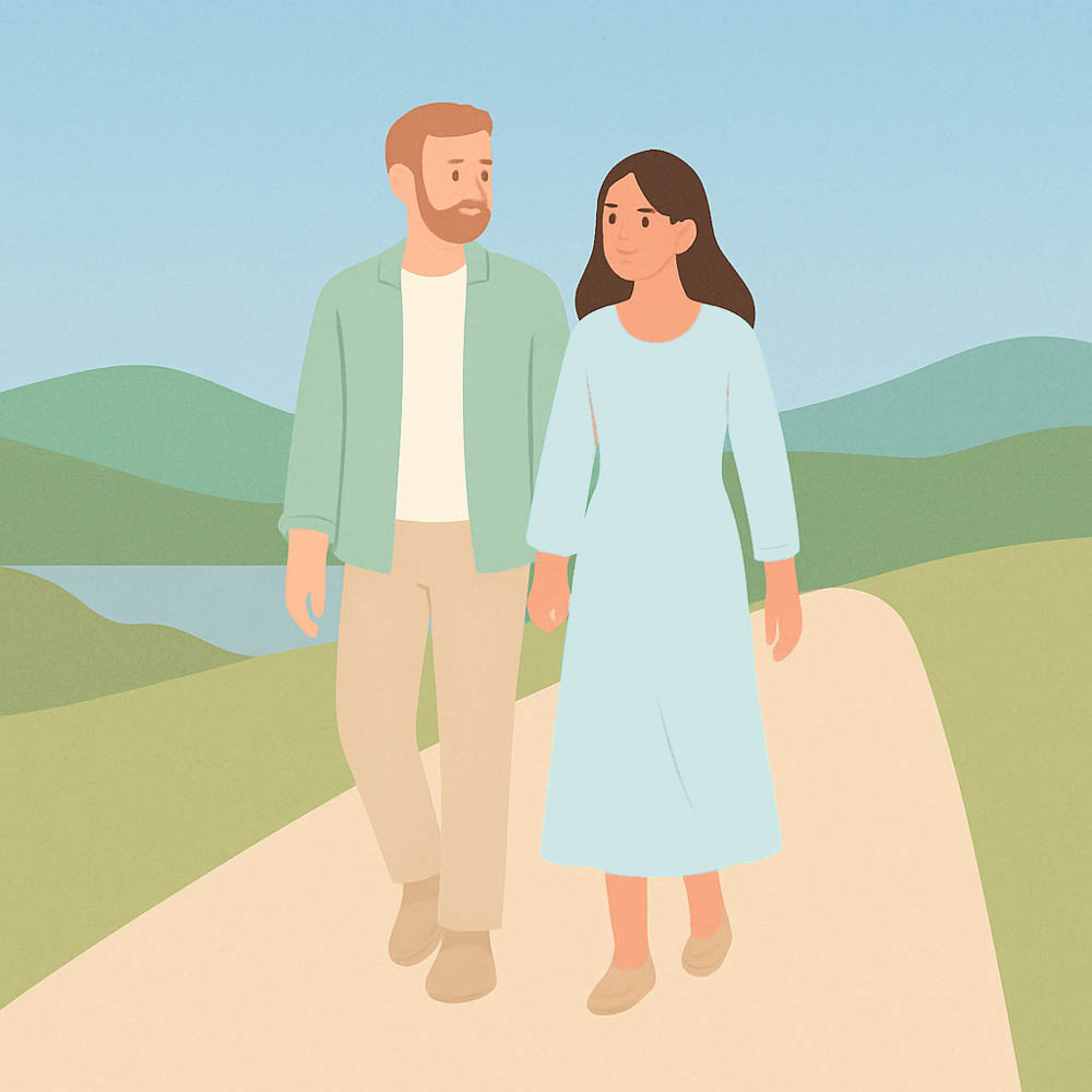
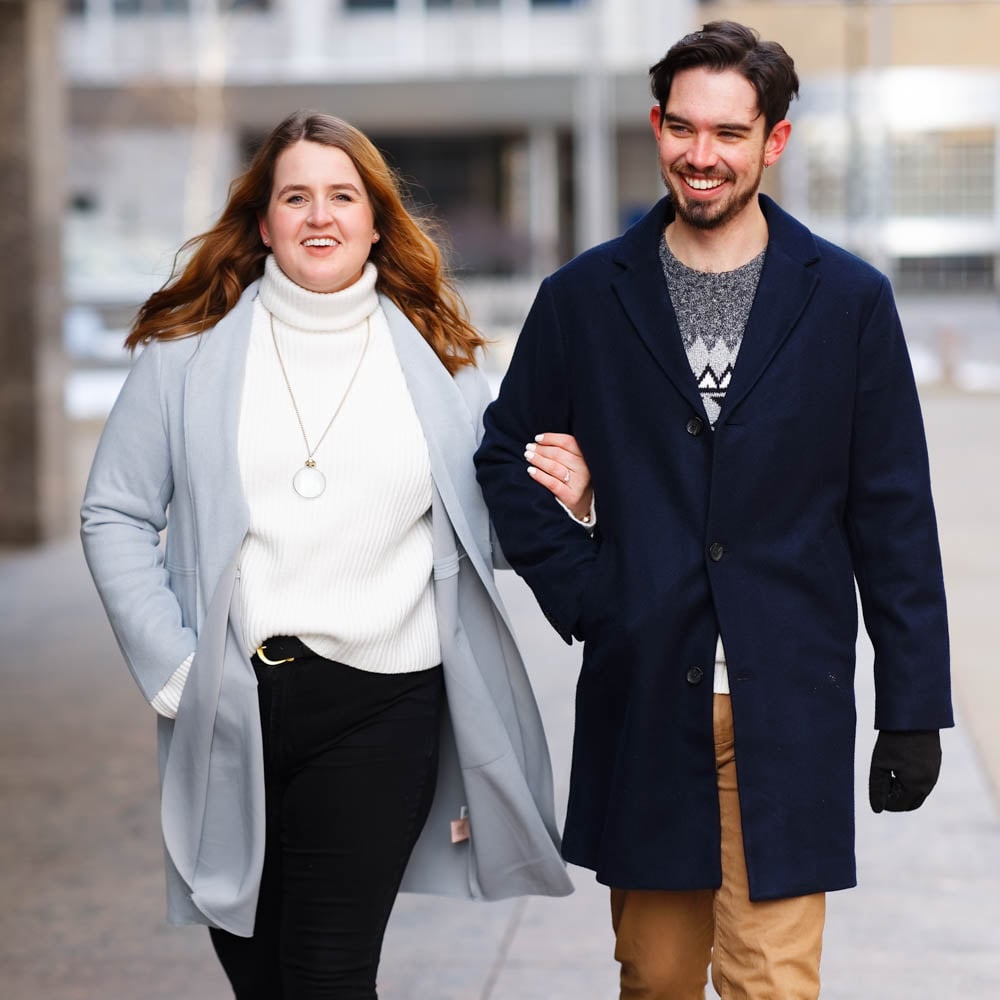
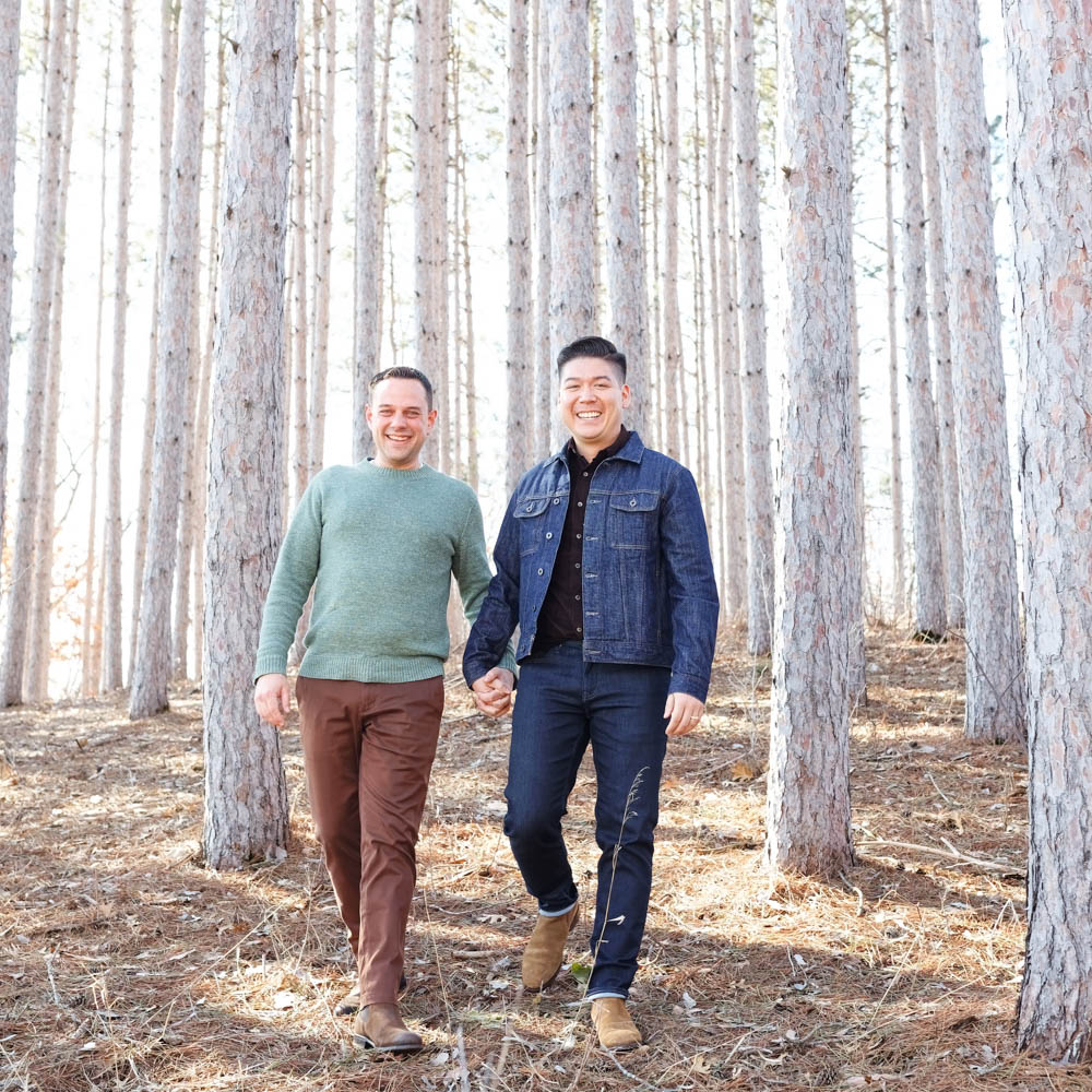
In fashion, white, black, and the full range of grays are classic neutral staples that pair with virtually anything. Beyond those, many muted colors—such as beige, taupe, navy, and olive—are also considered neutrals, especially when their saturation is softened. These hues act as flexible foundations in clothing because they complement a wide variety of colors without overwhelming the outfit.
Neutral colors match almost any other color, so stock up!
“White, black, and all gray tones are your neutral best friends”
Key Takeaway from Color Wheel Theory
Red or Blue are almost always good choices.
They contrast well with backgrounds and skin tones (not excessively) and are easy to find.
Pick one or two moderated saturated ones (red or blue) and combine them with neutral colors.
Part 3: How We See, Our Brain, Light & Attention
Remember, the goal is to guide attention to your face. Our brains are wired for survival, leading to unconscious reactions to visual stimuli like contrast, specific shapes, and color.
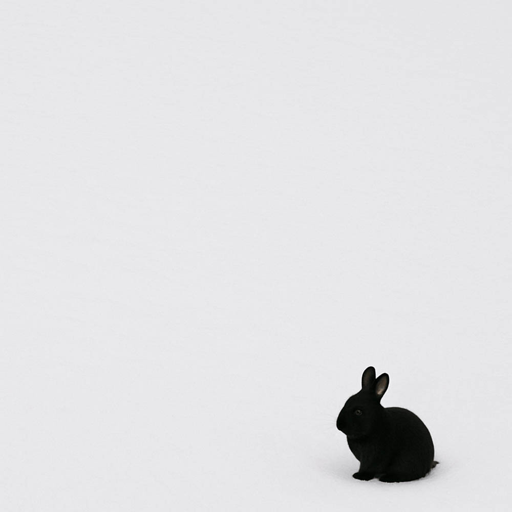
The Primacy of Tone Contrast
The brain prioritizes light-and-dark contrasts over color. Strong contrasts immediately grab attention. (Think of a dark rabbit on white snow).
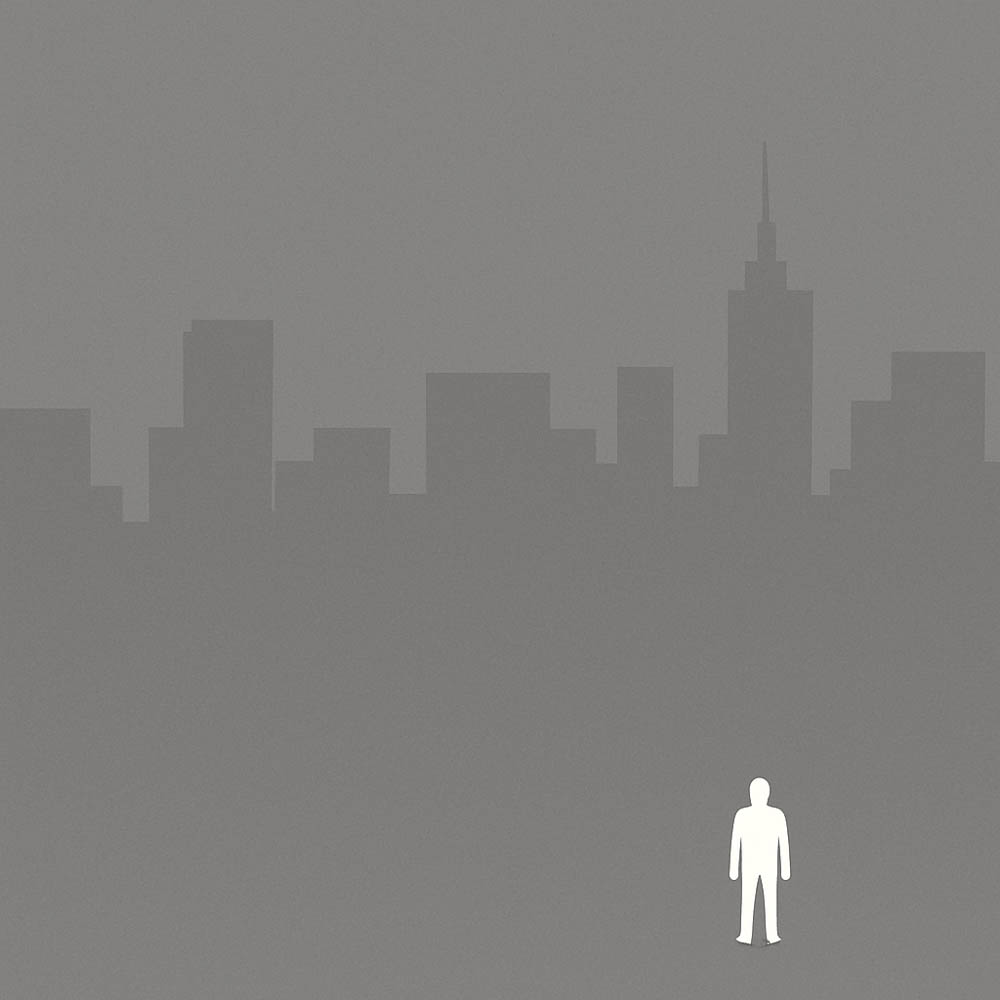
The Allure of Brighter Tones
Our environment is often darker, so brighter elements stand out. Use bright tones to highlight, darker tones to downplay.
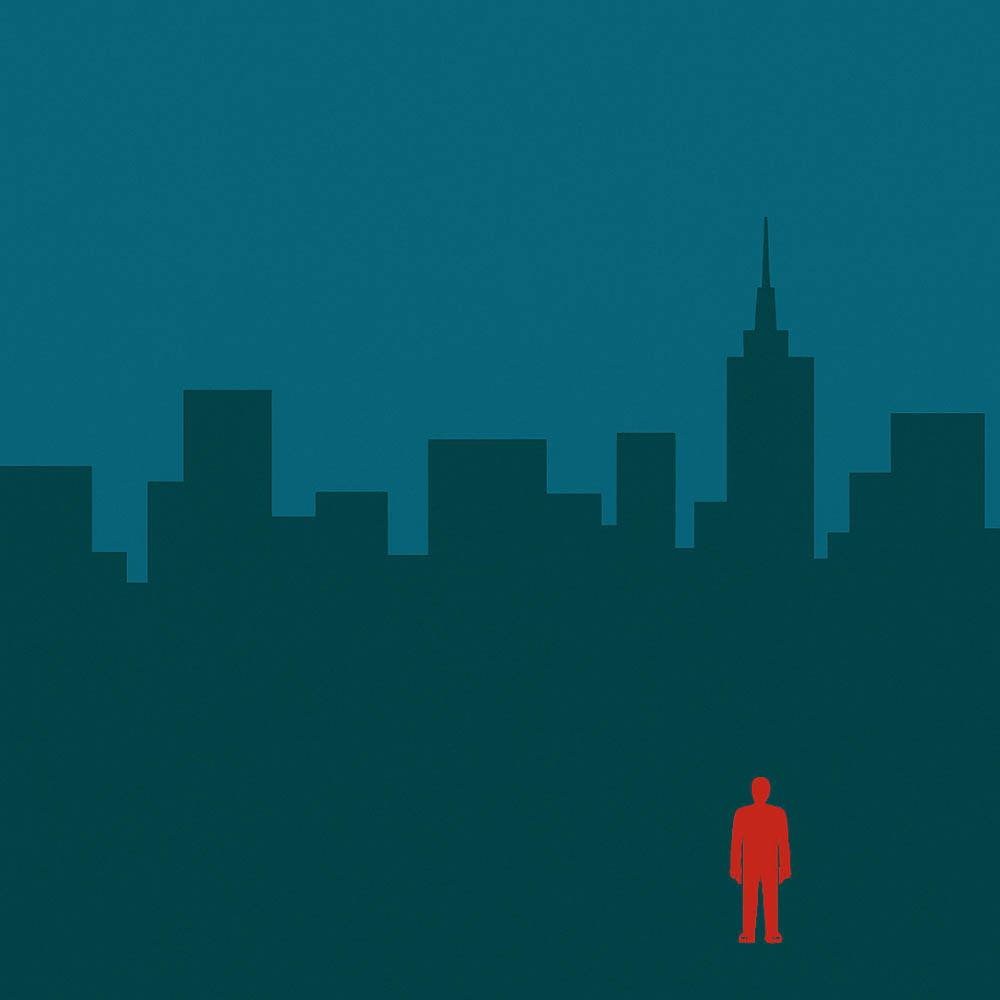
The Demand of Vivid Colors
Bright, saturated colors are highly visible (like ripe fruit). This is why bold red lipstick works!
Part 4: Direct and Practical Applications of Contrast & Brightness
Know Your Personal Contrast
Consider your skin, hair, and eye color. (More on this later).
Couples & Groups
If there’s high contrast between individuals, aim for medium-toned clothing for all. Maintain similar tonal ranges within a group.
Background Awareness
Your outfit should pop from the background, but not so much that it’s the only thing seen.
You can take advantage of it, for instance, on a snowy day, any warm color would pop.
Subtlety is Key
Avoid prominent logos and busy patterns that steal focus.
Tops vs. Bottoms 2 Options
Generally, wear brighter colors for your top to draw eyes upward to your face.
Another stylish option is for Partner 1 to wear a bright-colored top while Partner 2 coordinates by wearing pants in the same color but a darker shade, creating a balanced and cohesive look.

Layering Strategy
The innermost layer is brightest and progressively darker outwards (e.g., white tee, light gray cardigan, dark gray jacket).
Having an open, unbuttoned shirt or jacket with a white T-shirt underneath works very well.
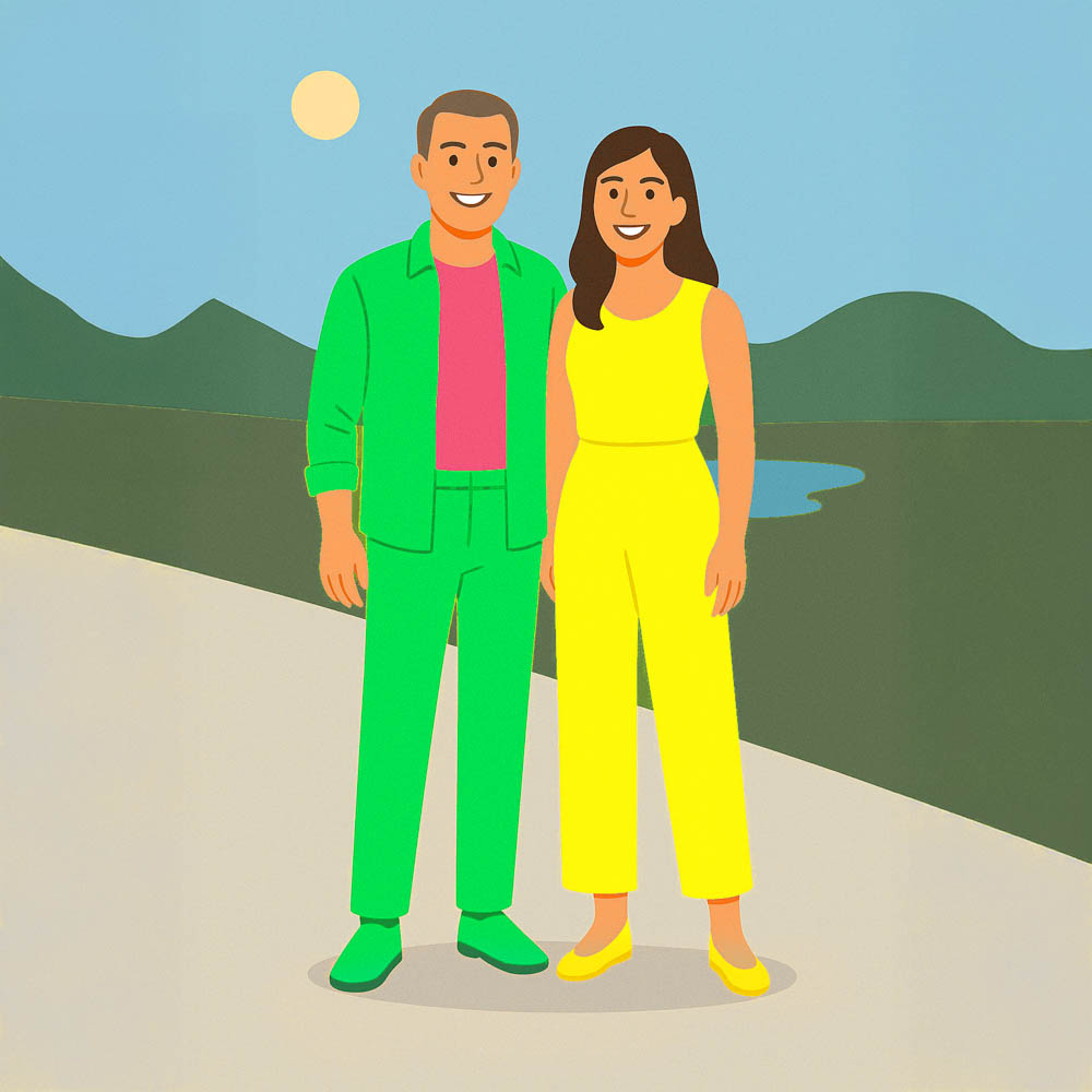
Vivid Color Use
Use sparingly. One vivid piece is often enough, balanced by muted or pastel tones. Stick to a maximum of three main colors.
Eye Focus
If you want your eyes to be noticed, don’t wear the exact same, brighter color right next to your face. Instead, use the same darker color or a darker complementary color.

Use Alternatives to pure Black.
For photos, often a very dark tone of a color (deep navy, charcoal) is better than pure black.
Part 5: Seven Techniques from Color Theory for Outfit Coordination
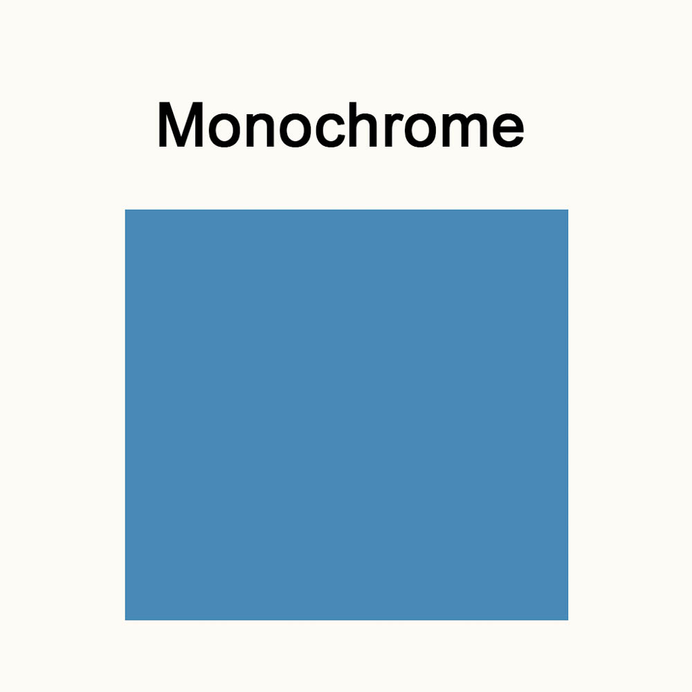
1. Monochrome Look (1 color + neutrals):
Easy and elegant for solo shoots. Pick a color flattering to your features (e.g., a blonde person in a red dress with black shoes).
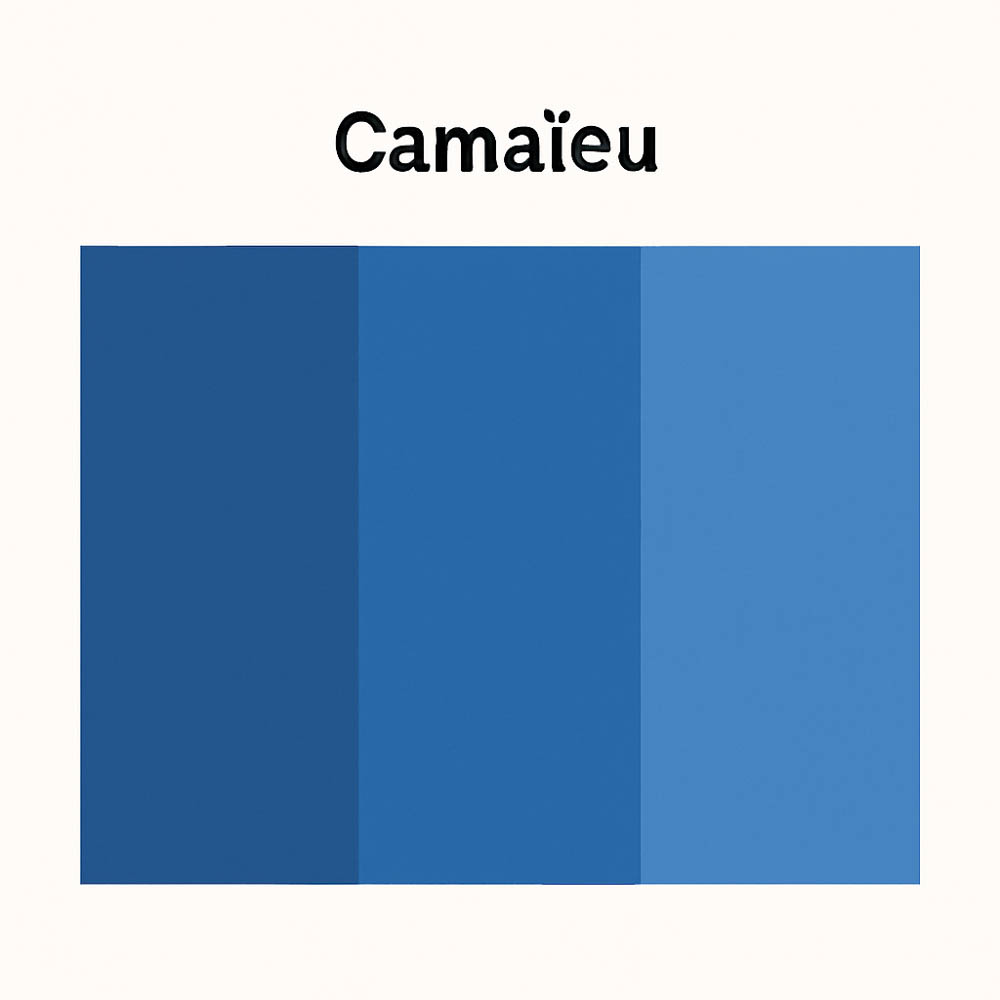
2. Camaïeu (1 color, several tones/saturations)
Uses one hue (for instance, blue) in various shades and tints (example: light blue, dark blue, unsaturated blue). This is an elegant and easy technique, especially if you have a favorite color in your wardrobe.
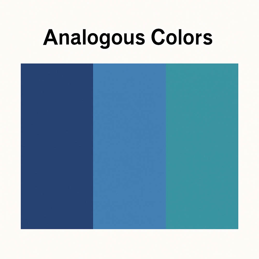
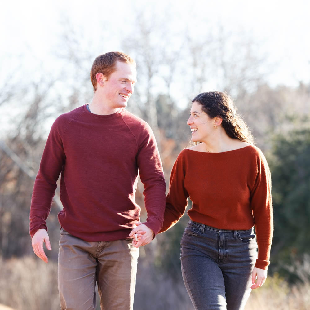
3. Analogous Colors (2-3 adjacent colors)
Similar to the Camaïeu idea, except you also play with the shades and saturation of neighboring colors on the color wheel (e.g., blue with green-blue and blue-purple). You don’t have to select one dominant color; they can all be more or less equal, and you can play with saturated and muted versions.
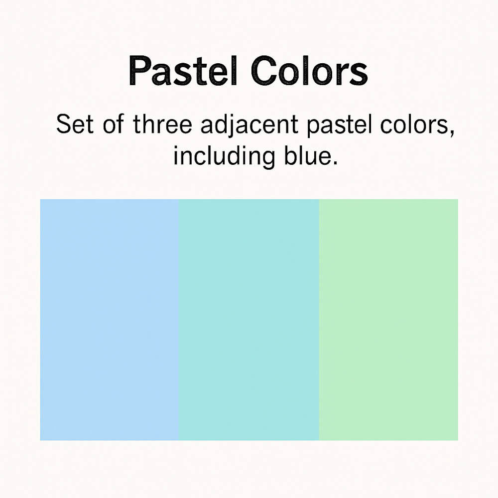
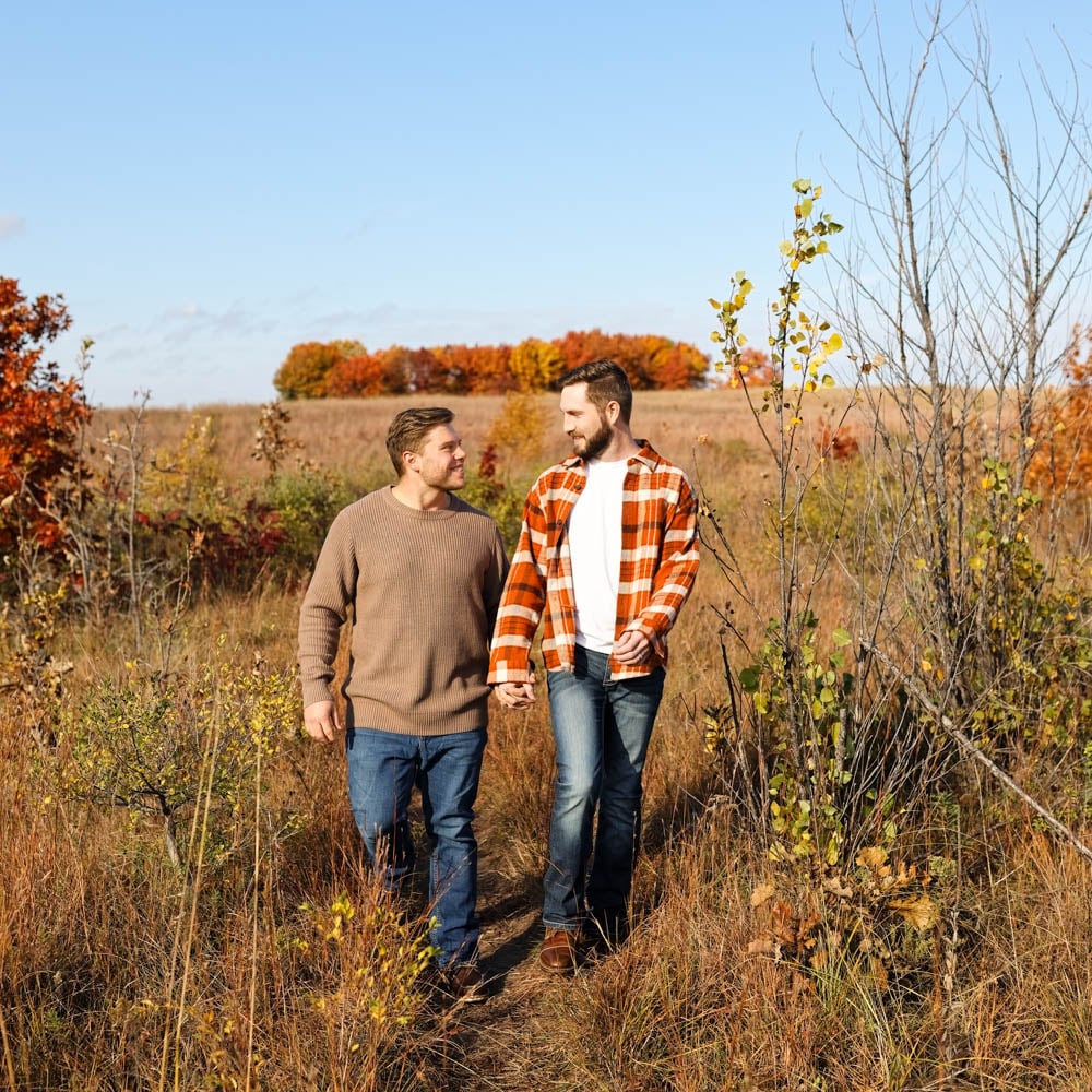
4. Pastel Colors or Dark Muted Shades (2-3 colors)
This look often involves analogous colors, but these specific palettes work so well that they deserve special mention. A great and elegant idea is to compose your ensemble using either dark muted tones (like dark red/burgundy, with dark orange/bronze, and dark yellow/mustard) or bright unsaturated tones, also known as Pastels (like bright unsaturated blue/light steel blue, with bright unsaturated cyan/pale turquoise, with bright unsaturated green/jade). For each of these categories, you can almost pick any combination, and it would work.
5. Complementary Colors (2-3 colors, with care)
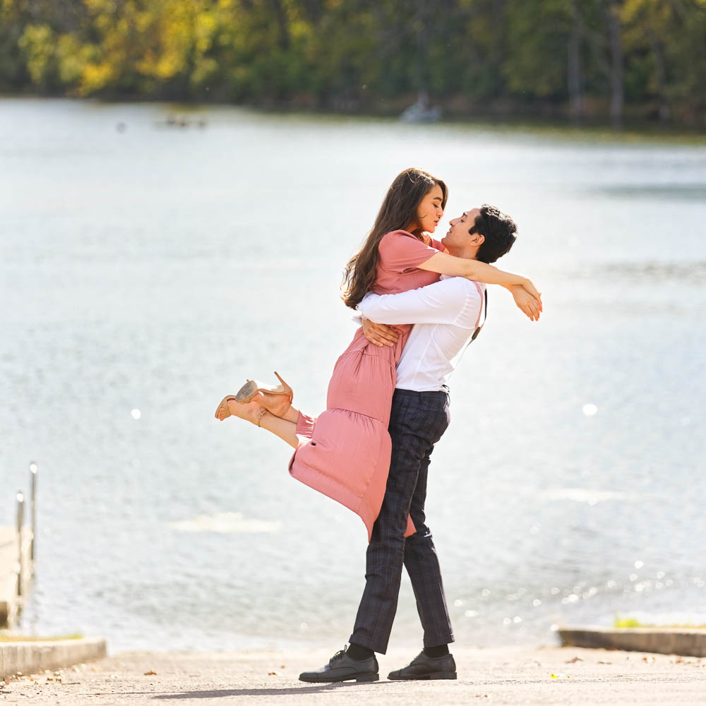
This is a very contrasting style that strongly catches the attention. Therefore, one should be careful not to create a flashy look! The primary color in a complementary pair is usually perceived as stronger than the secondary when compared at the same tone and saturation level. That’s why the primary color should usually be preferred for tops. For instance, a red top and green pants. Adding neutral colors is, of course, a great idea to reduce and soften high contrast.
6. The Triad Colors (2-3 colors, with a lot of care)
Pick one color, and the wheel will indicate two additional colors to use. This creates a very colorful outfit (Superman and Wonder Woman costumes are designed with triad colors). Nevertheless, the triad colors work great together without being as jarring as some complementary color combinations. For photography, pick only one true saturated color to dominate, and use less saturated ones for the other colors to prevent clothes from distracting from your face.
7. The Split Complementary Colors (2-3 colors, reserved for the expert)
Pick one color, and then pick the two colors adjacent to its complementary color. Use your main color as the dominant one, and add touches of the split complementary ones. For instance, if you pick red, its complementary color is green, so the split complementary colors would be yellow-green and blue-green. Pay attention not to end up with a look that’s too flashy.
Part 6: Color Theory vs. Real-World Wardrobes
Let’s be honest: even if all the harmony theories mentioned above are great, and even if the color wheel is a helpful tool, it’s complicated to always apply these rules strictly to your wardrobe with pure, vivid colors.
Unless you are a fashion model or someone with a very eclectic style, your wardrobe is likely full of neutrals, darks, and pastels. As a result, while the color wheel is a great tool, its application to clothing often involves more muted versions of these colors. For clothes, it can help you avoid bad color choices, but it can also be overwhelming if taken too literally.
Muted Tones & Earth Tones & Pastel Tones
Muted tones are colors that have been softened by adding gray, black, or white, reducing their saturation. They include soft versions of any hue—like slate blue, dusty rose, or moss green—and often overlap with earth tones, which are muted colors inspired by nature (such as terracotta, olive, and sand).
Muted tones could almost be considered neutral colors. Actually, in theory, the real neutral colors should be only the shade of gray.
While pastels are light and airy due to added white, muted tones feel more grounded and versatile across seasons and skin tones.
Why do muted tones & earth tones work so well today?
In today’s society, the bold, vivid clothing colors that were proudly worn 70 years ago—made possible by petrochemical dyes and industrial color innovation—have gradually given way to more desaturated, muted tones. Open most people’s closets and you’re unlikely to find vibrant purples, saturated pinks, or electric blues (unless you’re a die-hard Vikings fan).
Muted tones create gentle contrast, flatter a wide range of complexions, and let the subject, not the outfit, shine in photos. They’re subtle enough to combine effortlessly, yet rich enough to add visual depth, making them a timeless and reliable choice for styling.
Pastel Tone works for Summer.
Pastel tones work great in bright, airy settings—like spring or summer sessions—where their lightness enhances a soft, romantic mood. They’re especially flattering on fair skin and in natural light, creating a fresh and delicate look without overpowering the scene.
White and Bright, a classic
Bright tones like white and cream work well in nearly any setting because they reflect light and draw attention to the face without clashing with the environment. Often synonymous with chic simplicity and understated elegance, these tones are versatile enough to layer or pair with both muted and vivid colors, offering a clean, timeless look.
Timeless black and white suit in the city
A timeless black-and-white outfit always works in a city setting, especially for men wearing a suit with an open jacket and an unbuttoned white shirt. The contrast is sharp yet effortless, blending elegance with a relaxed, confident style.
Part 7: Real-Life Outfit Color Examples
(User, this section critically requires your expertise and specific visual examples. Replace the template below with 3-5 detailed examples relevant to your photography style and client base, explaining the color choices, textures, and how they fit the setting and subjects.)
“Okay, theory is great, but what does this look like in practice? Here are a few combinations that consistently work well for photo sessions:
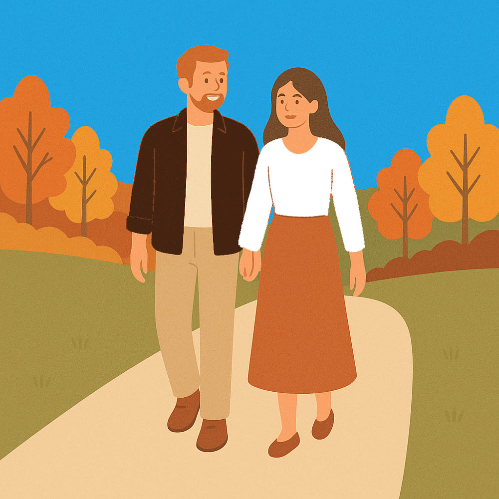
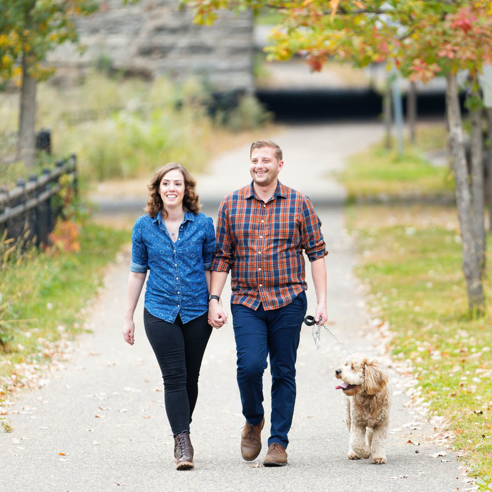
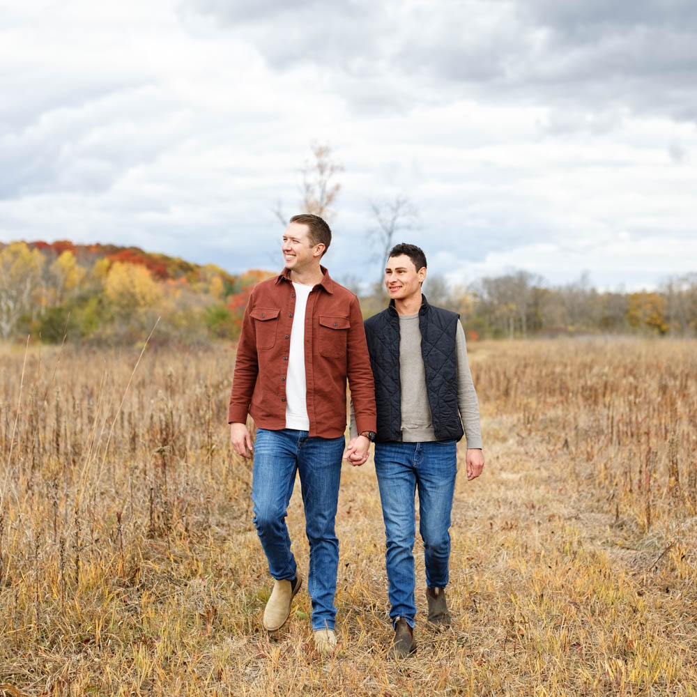
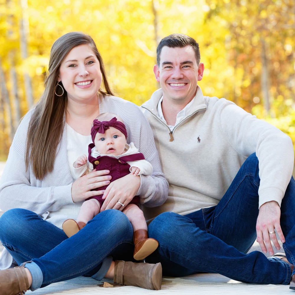
Example 1: Casual Autumn Engagement or Family Session
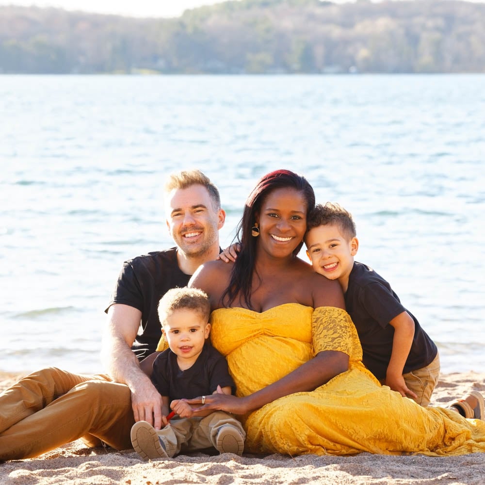
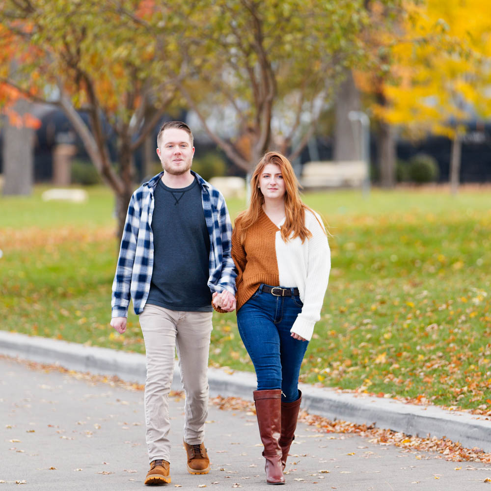
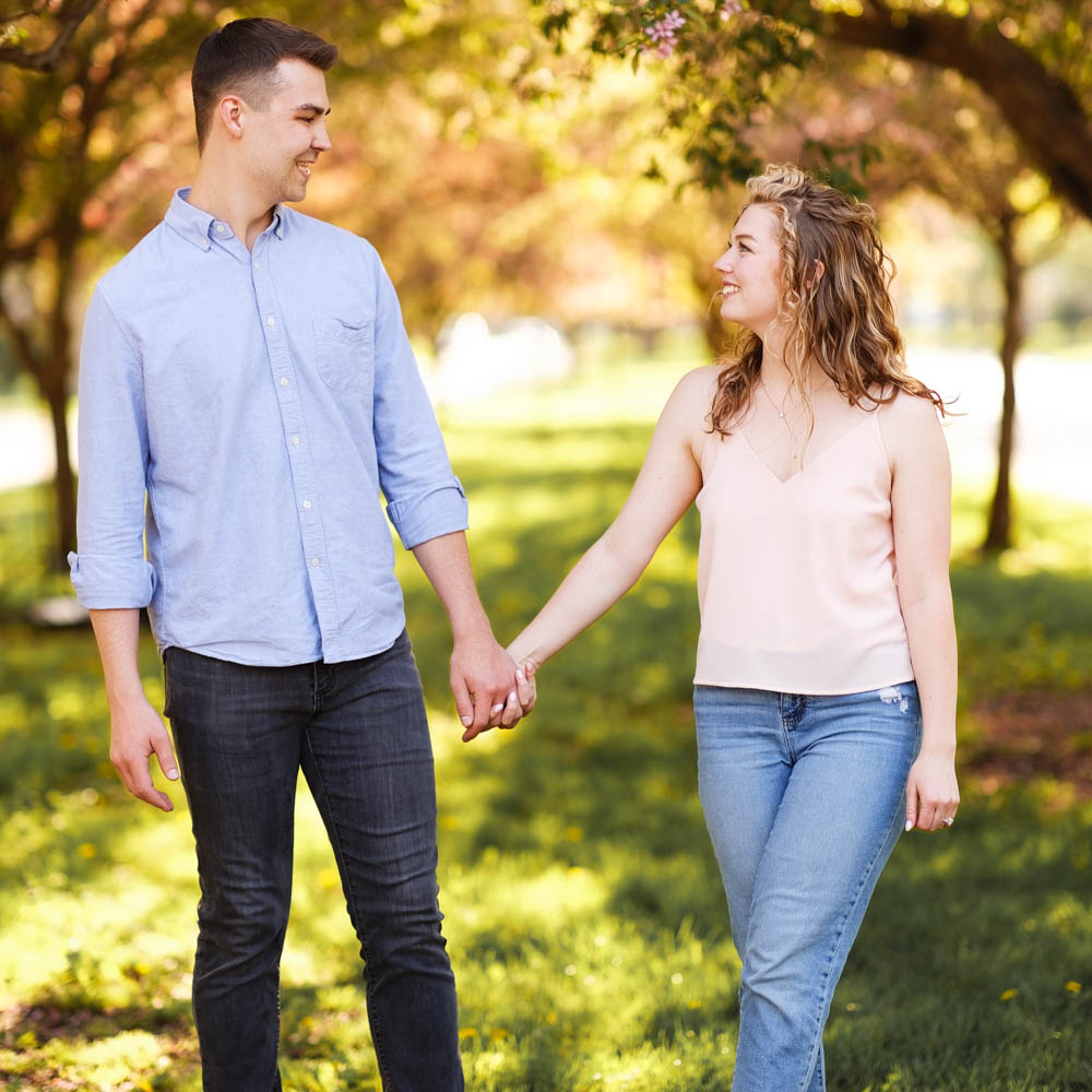
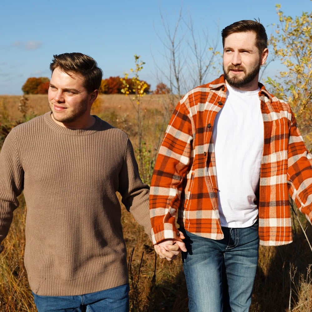
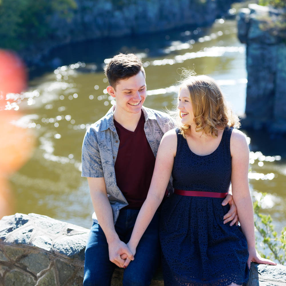
- Key Elements: Mustard yellow chunky knit sweater, dark wash jeans, brown ankle boots (Mom); Navy blue flannel shirt (subtle plaid), khaki pants (Dad); Cream top, burgundy corduroys, denim jacket (Child).
- Why it Works: A mix of textures, harmonious autumnal colors (mustard, navy, burgundy, cream, brown) with denim as a unifying neutral. No one color screams for attention. Mustard (muted tertiary) is warm. Denim is a strong neutral. Burgundy (muted primary derivative) pops gently.
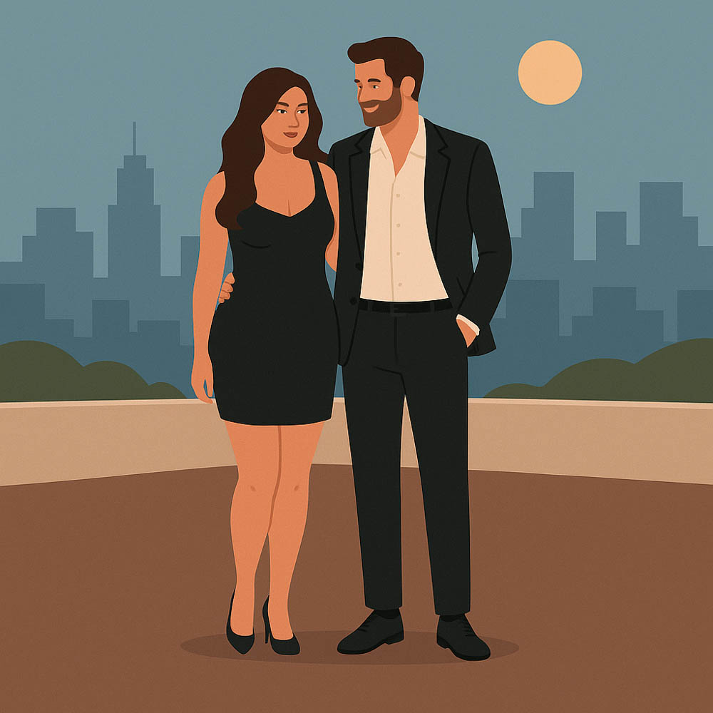
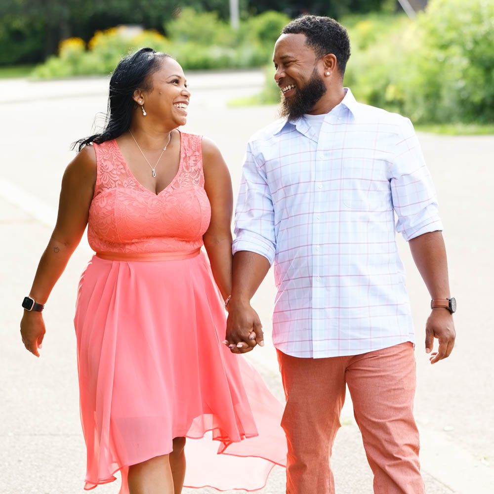
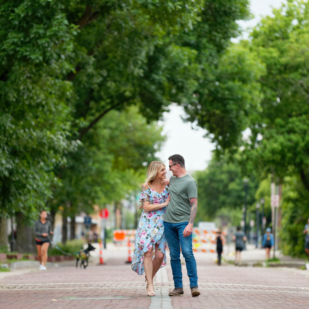
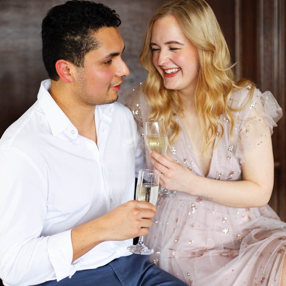
Example 2: Elegant Urban Engagement Shoot
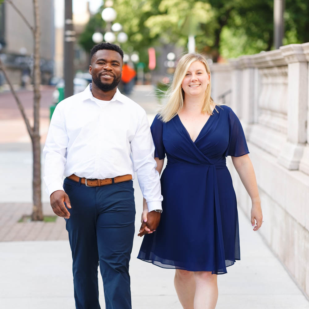
- Key Elements: Charcoal gray well-fitted suit/dress pants & blazer, crisp white shirt (Partner 1); Flowing dress in a rich jewel tone like sapphire blue, emerald green, or deep red (Partner 2).
- Why it Works: Classic, sophisticated neutrals for one, allowing the jewel tone on the other to provide an elegant block of color that contrasts beautifully with urban backgrounds, shared elegance creates cohesion.
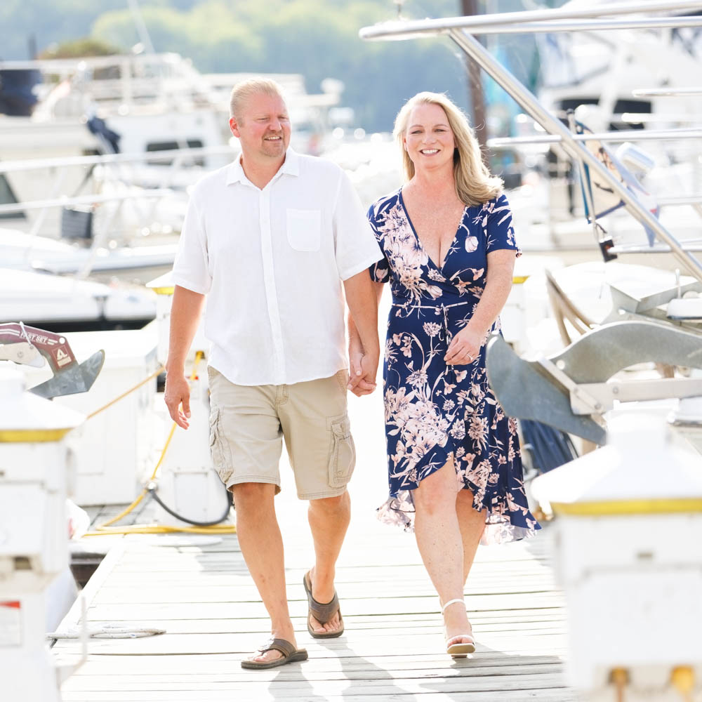
Example 3: Bright Summer Session
- Key Elements: Light, airy fabrics. White linen shirt/dress, or soft pastels like light aqua, coral, or pale yellow. Khaki shorts or a light-colored skirt.
- Why it Works: Bright and light colors complement the beach setting. Pastels are soft and don’t compete with natural beauty. White is classic and reflects light beautifully. Avoid dark, heavy colors.
Part 8: Managing Patterns, Stripes, and Other Details
These elements add contrast and can attract attention. The goal is to complement, not distract from your faces.
Patterns
- Subtlety Wins: Small, repetitive patterns often read as a solid color from afar.
- Flannel Plaid: Contrast depends on band size and colors. Some work, others are too loud.
- Florals: Can be beautiful if shapes, colors, and contrast are balanced.
- Generally Avoid for Portraits: Busy African prints, loud Madras patterns, most camouflage, large or distracting animal prints, disparate multi-design patterns (e.g., Desigual style), and patterns with widely spaced, large elements.
Stripes
The “vertical slims, horizontal widens” idea is an oversimplification. It’s about contrast and the rhythm these lines generate. Thin, subtle stripes are usually fine. Bold, high-contrast stripes can be distracting.
Dots, Faces, Characters, and Text
- Faces/Animals/Characters: Our brains quickly recognize these, drawing focus from the subject’s actual face. Best to avoid.
- Text: Readable text is highly distracting. Avoid clothing with prominent logos or messages.
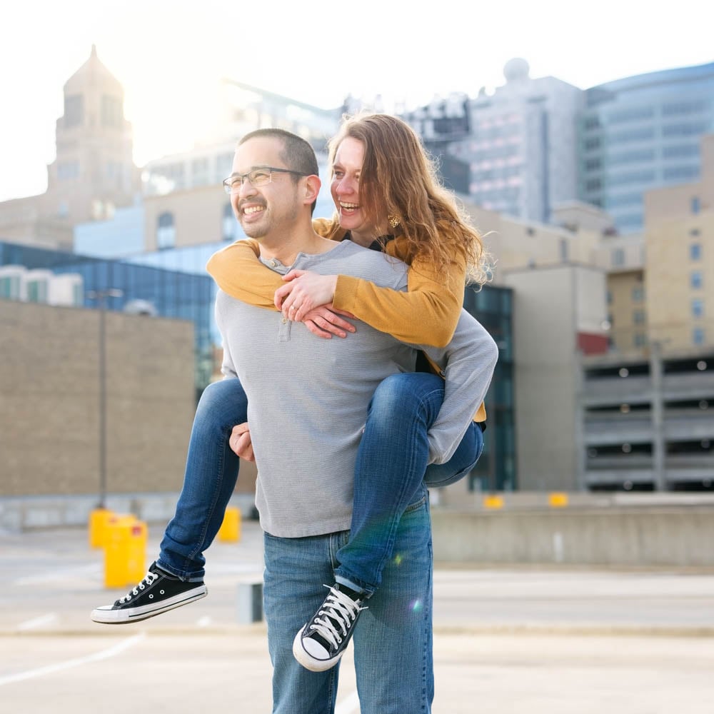
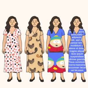
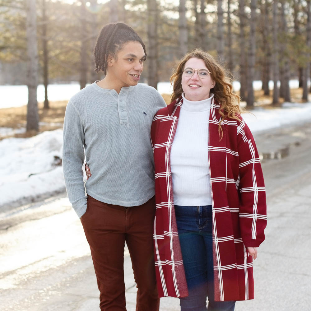
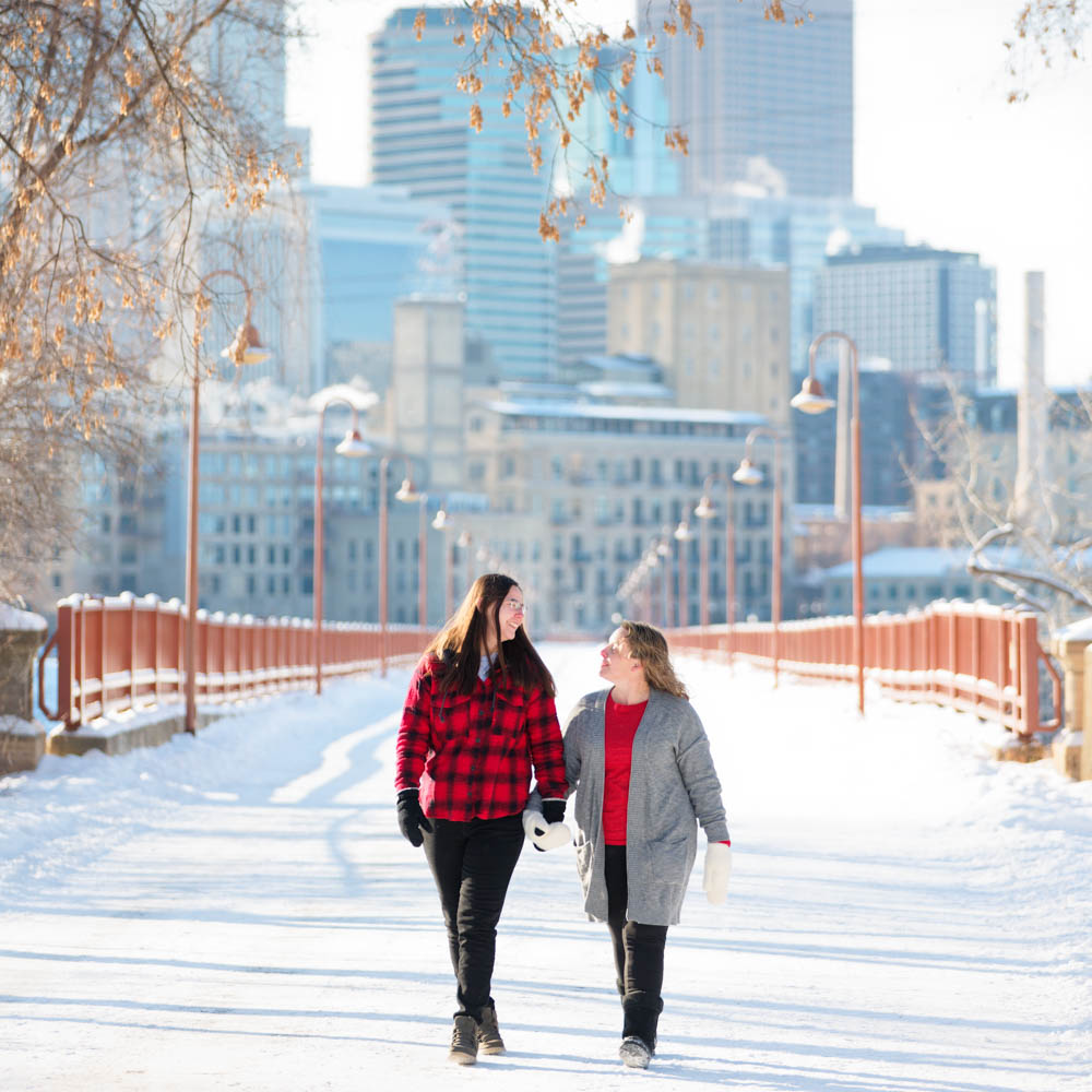
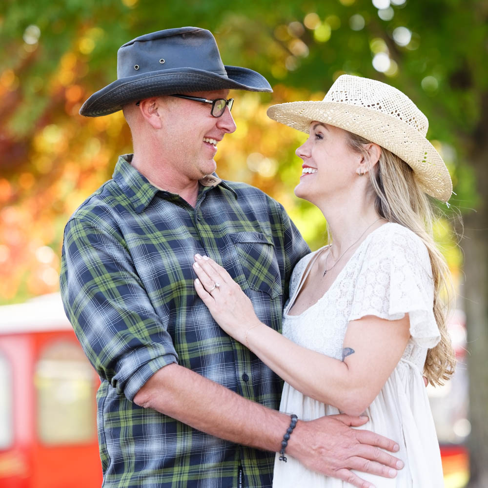
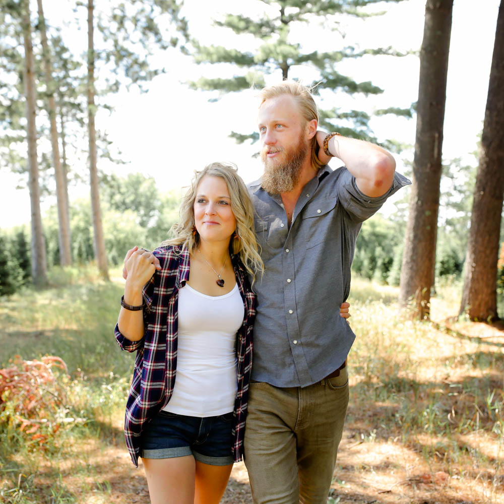
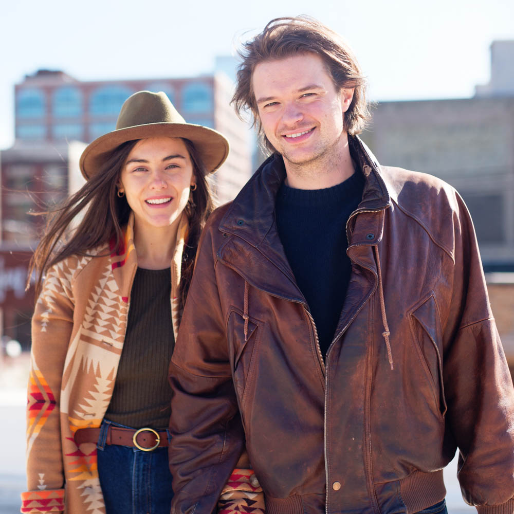
Example of an outfit with a pattern, flannels, and a logo in real life.
While there’s no strict rule against patterns, logos, or textures, some clothing choices are more flattering on camera than others. The gallery beyond offers a range of real examples to help you assess what tends to enhance a photo and what can become a distraction. Use these images as a practical reference when selecting your outfit.

Part 9: The Underestimated Power of Material and Texture
Materials convey meaning (cashmere = luxury, linen = summer chic).
Prioritize real fabrics where possible.
Texture’s Visual Impact
Texture is as important as the material itself! It results from how the fabric is produced and dramatically changes its appearance and light reflection. Two outfits of the same color but different textures won’t look the same (e.g., a red cashmere dress with a red leather coat).
The size of the yarn, its fabrication, and the knitting method all change the material’s aspect. Knitting can even create patterns!
“Powerful” Fabrics: Use One Dominant Type
The shinier a textile is, the more it catches the attention. For this reason, you should compose your outfit by choosing only one dominant shiny material, if any, balanced by matte finishes.
Avoid anything approaching glitter or mirrors unless for a very specific stylistic effect. Examples of shiny or attention-grabbing materials include: silk, satin, leather, patent leather, some furs, velvet, velour, sequins, crepe, denim, tweed, lace, and linen.
Of course, in fashion, the materials are often directly linked to the style…
Part 10: Nailing Your Clothing Style
Style also means a lot and carries an identity. Therefore, it is important to match your styles within a group. If one of you has an elegant evening outfit, the other shouldn’t be in sportswear.
For most photo sessions, I would recommend keeping it simple and using only one consistent style. If you are planning on an engagement session with two locations (ex, natural environment, and urban environment), then take two different outfits. One relaxed, and one more formal.
Here is a list of the common styles you could use:
- Classic & Timeless
Neutral colors, tailored pieces, simple silhouettes (e.g., navy, white, beige) - Casual & Relaxed
Jeans, tees, sweaters, or barefoot in nature - Romantic & Soft
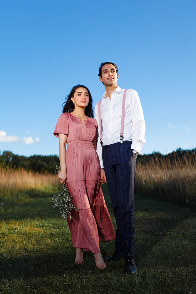
Flowing dresses, light pastels, lace, soft fabrics - Elegant/Formal
Suits, gowns, heels, sleek fabrics (great for city rooftops or luxury venues) - Boho/Free-Spirited
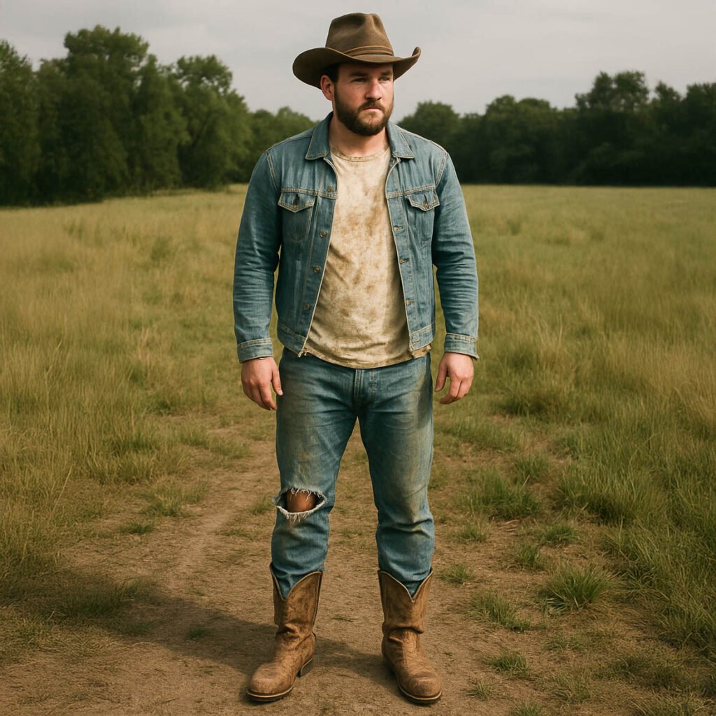
Earth tones, layers, textured fabrics, hats, flowy maxi dresses - Urban & Modern
Minimalist, monochrome looks or trend-forward outfits with clean lines - Rustic/Country
Denim, boots, flannel, earthy tones—ideal for barns, fields, or farms - Edgy & Bold
Black leather, strong contrast, graphic elements, striking silhouettes - Vintage-Inspired
Retro patterns, muted tones, nostalgic accessories (scarves, suspenders) - Seasonal Themes
Cozy knits for fall, crisp whites for winter, florals for spring, airy linens for summer
Common Style Mistakes to Avoid
An outfit is only as strong as its weakest piece. I often see couples looking great—except for one mismatched item, usually from the groom’s side (sorry, guys). Think dress shoes with a casual look, or an office shirt that clashes with a relaxed vibe.
My Recommendation: Lightweight and Long Dresses
If you are tall and slim, a lightweight long dress (evening or beach style) with a split can catch the wind and thus work extremely well in photos, especially for engagement sessions.
How You Wear Your Clothes Matters
There are subtle variations in how you wear your clothes that can produce different feelings (e.g., shirt buttoned up vs. some buttons open and sleeves rolled). However, for a classic photoshoot, avoid overly trendy or sloppy styling choices unless it’s a very specific, intentional fashion statement.
Part 11: Get Practical, Choose & Coordinate Your Outfits Effectively
Now, let’s go through a step-by-step process to get the best outfit for your session.
You Are the Starting Point
Your skin and hair color are fixed points. Choose colors that harmonize with them. (See the dedicated section later).
Define your style accordingly to your location.
The first thing to do is to decide on your style. The location you have chosen for your photoshoot should already give you some clues.
So, which part of your wardrobe are you going to use? The casual one, the formal one, or any other style.
Define your style accordingly to the weather & season
If it’s winter, dress in a warm coat, hat, and scarf. If it’s summer, then you can wear shorts.
Begin with a Favorite Piece
Pick a colored item of clothing you genuinely love, then build the rest of your outfit around it.
Wear What Fits & What You Love!
This is paramount! You must choose clothes that you love, that are your correct size, and that make you feel confident and comfortable.
Discomfort often shows in pictures.
Coordinate Colors: The Rule of Three (Maximum) for Colors
- One dominant color + neutrals: This is already a great approach for most couples.
- Two colors (one dominant + one less vivid): Creates an elaborate, stylish achievement.
- Three colors: These are more complex to execute well; it is best if you have ample clothing options and planning time.
Vivid Colors Versus Neutral Tones
Most people don’t wear head-to-toe vivid colors daily. Neutrals accented with brighter tones (like blue or beige) often appear “colored” and sophisticated. Too many vivid colors can be overwhelming.
The Power of Accents
Often, a simple touch of color in an accessory is enough, especially for large groups. This ensures harmony without needing everyone in bold colors.
Part 12: Matching Colors to Your Skin & Hair: Personalized Choices
Your unique coloring is the primary guide! The goal is to direct attention to your face. Cool colors are generally blue-based, while warm colors are red/yellow-based.
Low Contrast (e.g., light hair, fair skin)
- Often Flattering: Lighter tones, cool colors, soft pastels (sky blue, jade, light pink, lavender, soft yellow).
- Use Cautiously: Light beige if it’s too close to your skin tone; very dark tones (especially black right next to the face) can wash you out.
High Contrast (e.g., dark hair, very light/fair skin)
- Often Flattering: More vivid and clear colors (true blue, red, emerald green, purple).
- Use Cautiously: Colors too close to your skin tone (very pale pastels, beige, light yellow); bright gray can be less flattering than a clearer color.
Red Hair (often with fair to medium skin, creating medium contrast)
- Often Flattering: Bright and warm colors (certain reds, oranges, yellows, mustard, browns). Complementary colors like green and blue can also look great, as well as deep purples.
- Use Cautiously: Tones too close to your hair color or very vivid pinks/magentas that might clash.
Dark Hair & Tan/Olive Skin (medium-low contrast)
- Often Flattering: Warm colors (such as browns, dark reds, deep oranges, vivid oranges) and complementary colors (such as shades of green, teal).
- Use Cautiously: Some shades of pink, very muted purples, medium browns that blend too much, and beiges that don’t offer enough contrast.
Light to Medium Brown Skin & Dark Hair (medium-low contrast)
- Often Flattering: Both warm and cool colors can work (reds, greens, blues, purples). Pastels can also work well if they have enough clarity.
- Use Cautiously: Very vivid/neon pinks, cyans, bright yellows, and bright yellow-greens if they feel overpowering.
Dark Hair & Dark Skin (often low contrast between hair and skin, but potential for high contrast with clothing)
- Often Flattering: Many colors can work beautifully; you can often carry vivid and bold colors very well.
- Use Cautiously: Dressing entirely in unrelieved white, very light pastels, or pure black might not be as dynamic as richer or more vibrant hues, but this depends on the specific shades and desired effect.
Always consider the photo session’s background and lighting! Fall colors, green landscapes, snowy fields, or urban grays will all interact differently with your outfit.
Final Polish: Other Key Tips
Tips: Condition of Clothes
Avoid old, visibly worn, or dirty clothes. Sin is in the details, especially in pictures. We will notice any scratches.

Tips: New Clothes Prep
If you buy new clothes for the photo session, pay attention to wrinkles. Try to wash and iron them beforehand if appropriate (for instance, a new cotton shirt).
Tips: Enhancing Eyes with Clothing Color
Makeup is a powerful tool, but clothing choices also impact how eyes appear:
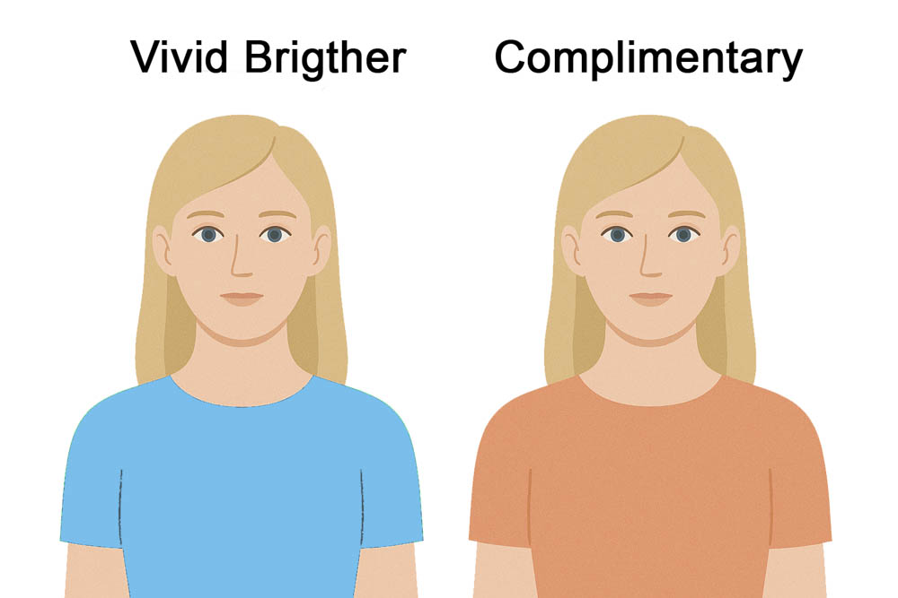
- Dress with a Complementary Color:
- For blue eyes, consider warm orange tones (peach, coral, rust).
- For green eyes, dark red tones (like burgundy) or purples can be flattering.
- For brown eyes, warm tones (like warm browns, beige, olive green, or mustard yellow) often work well.
- Avoid a Brighter/Same Hue Top: Wearing a top the exact same hue as your eyes, especially if it’s brighter and more saturated, can make your eyes look dull by contrast. If you choose a similar color, opt for something slightly less saturated or a bit darker than your eyes.
- Echo Eye Color with Accents: Use a touch of color in a necklace, earrings, or a pattern with a touch of your eye color.
- Background Synergy: A background that subtly incorporates colors reminiscent of your eyes (but less saturated and not brighter) or shows a touch of similar color can be harmonious.
Tips: Echoing Colors with Props (A Little Goes a Long Way!)
A simple touch of color using props is usually enough.
- For Women: Consider a scarf, necklace, earrings, makeup (lipstick, nail polish), hat, hair bands, hair clips, glasses, shoes, bracelets, rings, a purse, a belt, or a watch.
- For Men: Options include a scarf, subtle necklace or bracelet, hat/cap, glasses, shoes/shoelaces, pocket square, tie, belt, watch, or socks for a fun pop.
- For Kids and Groups: A blanket, subtle toys (if theme-appropriate), or helium balloons (used thoughtfully) can add a touch of color.
Specific Advice for Family and Group Photos
The typical mistake to avoid:
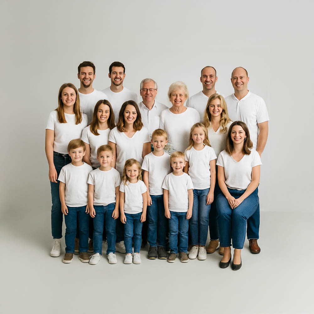
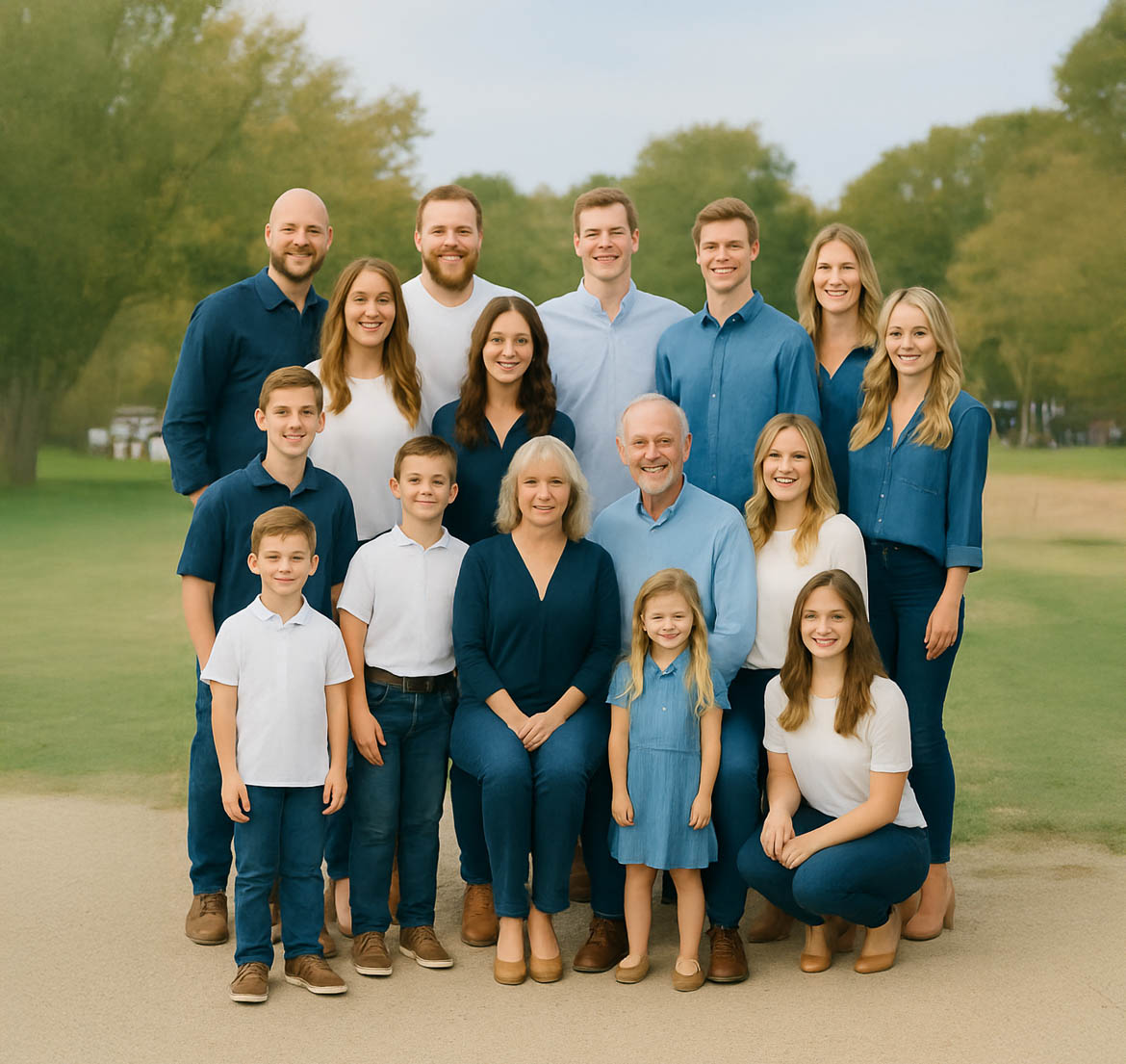
Avoid matching all the outfits the same, instead, coordinate.
All principles apply. Aim for a harmonious color palette (e.g., 1-2 main colors + neutrals distributed among members) rather than identical outfits.
Identical outfits work for teams or companies, not for families.
Avoid Distracting Elements (logo, patterns), instead choose a plain outfit.
Avoid having anyone wear clothes with prominent text or very impactful, distracting images.
Avoid too Saturated Colors. Instead, limit to one or two pieces.
Avoid having too many highly saturated colors; one very saturated item maximum, or small accents.
Avoid having colors more Saturated than the Kids.
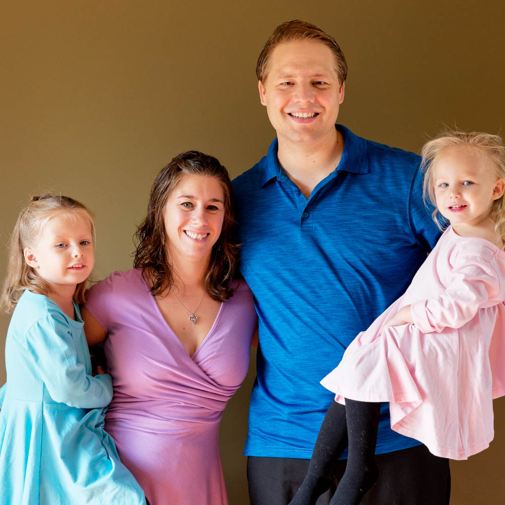
What to do with the kids’ outfits? Highlight the Kids
Consider dressing children in slightly brighter or more distinctly colored outfits so they naturally catch the eye.
Key Takeaways for a Picture-Perfect Outfit
- Focus on the Face: Your outfit should enhance, not distract from, you.
- Master Contrast & Tone: Often more crucial than exact color hue. Use brights to highlight, darks to recede.
- Limit Your Palette: Stick to 1 main color plus neutrals for a cohesive look. 2 colors are usually enough, three colors are risky (choose wisely).
- Flatter Your Features: Choose colors that complement your skin tone, hair, and eyes.
- Fit & Comfort are King: Wear clothes you love, that fit impeccably, and make you feel confident.
- Neutrals are Your Friends: Use them as a base to build upon.
- Consider the Setting: Coordinate your outfit with the location, season, and style of the shoot.
Final Thoughts
Ultimately, the ‘perfect’ outfit is one that makes you feel confident and allows your personality to take center stage. While these guidelines provide a strong foundation, don’t be afraid to let your personal style shine through. By understanding these principles of color, contrast, and style, you’re well-equipped to make choices that enhance your photos and help create lasting, beautiful memories. Now, go plan those amazing outfits with confidence!